2023 Week 12 | Data Syncs & Scheduling
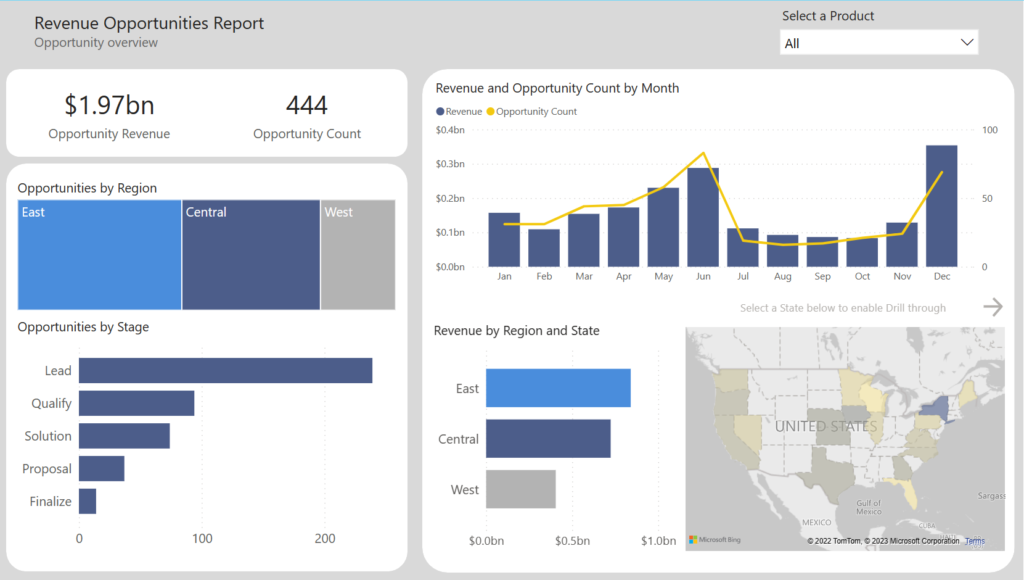
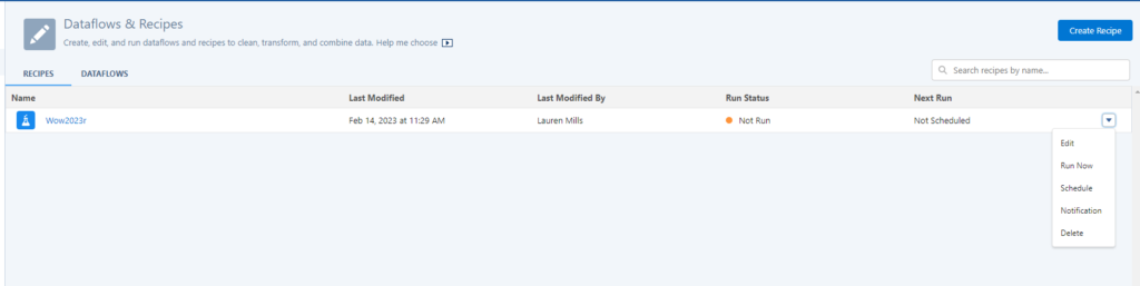
Introduction Hello and welcome to WoW week 12! This weeks challenge will be short & sweet from a requirements perspective but will hopefully provide valuable insights to help you optimize your data sync cycle. Tip… check out the Tips section! Requirements Navigate to the dataset created in a previous exercise, or create a new one […]
2023 Week 12 | Data Syncs & Scheduling Read More »