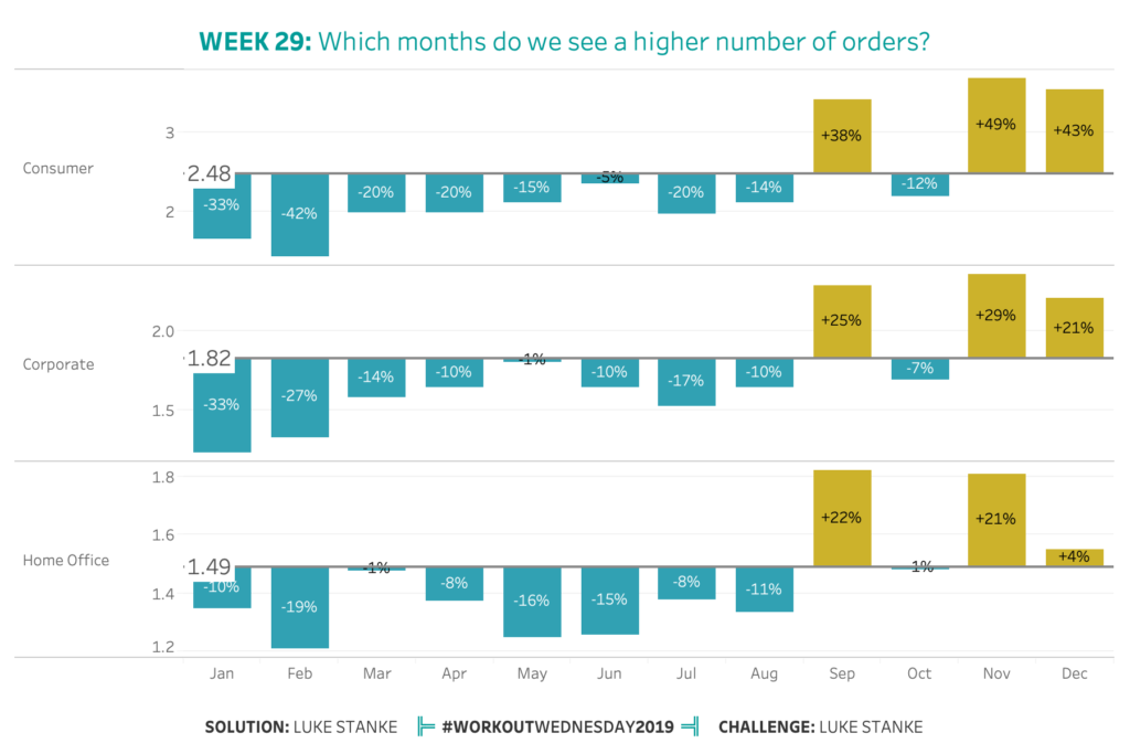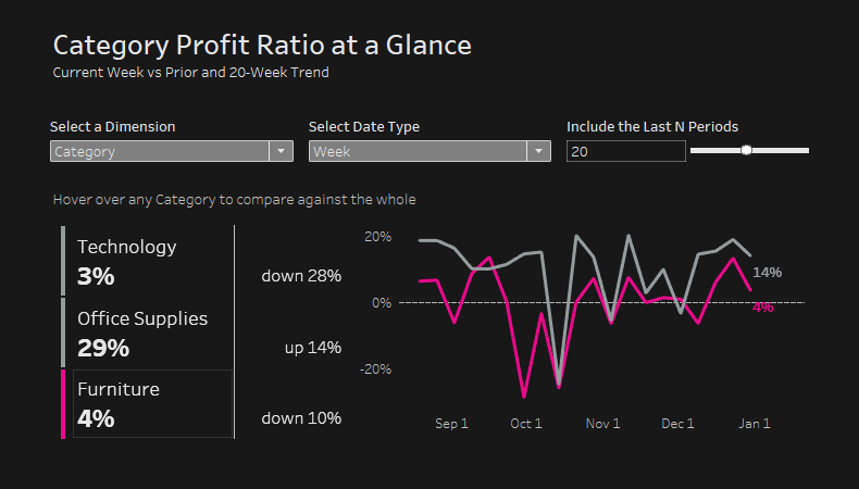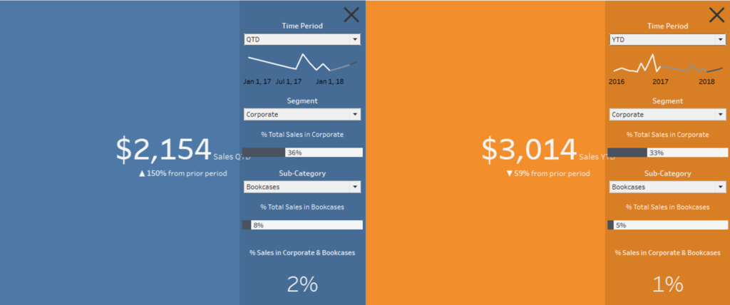
Week 30: Creating a Navigating KPI Block
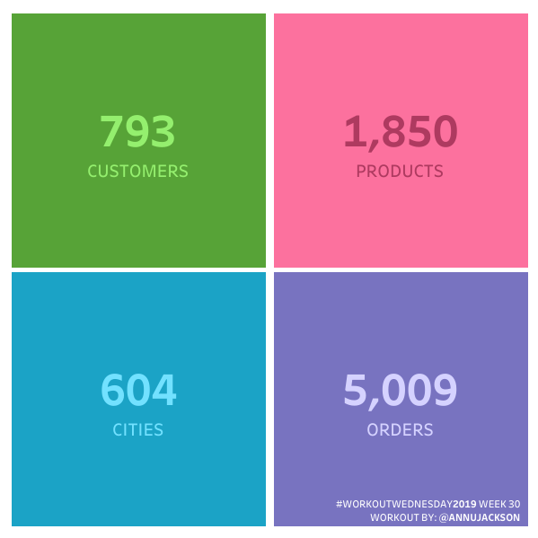
If your schedule is anything like mine, then you’re probably enjoying the summer months – using vacation time, nicer weather, summer holidays, and a generally more relaxed schedule. To help keep that vibe going, this week I’m challenging you to a very straightforward build. This is an extremely simplified version of something I recently built […]
Week 30: Creating a Navigating KPI Block Read More »
Tableau, Workout Wednesday