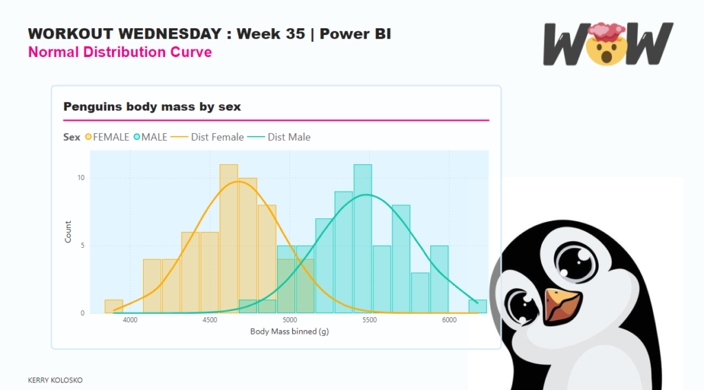
Power BI

2024 Week 28 | Power BI: Create custom navigation with Zoe Douglas

Introduction Welcome back to Workout Wednesday! This week’s challenge is purely dataviz – there is no data transformation involved. A huge thanks to our friend and colleague Zoe Douglas for providing us with a beautiful and fun report to recreate. Find the data and instructions to complete the challenge below, and as always, have fun! Requirements […]

2024 Week 28 | Power BI: Create custom navigation with Zoe Douglas Read More »

2024 Week 27 | Power BI: Scatter plot showing the path of selected data points

Introduction The challenge for this week is to first build a scatter plot of fertility vs life expectancy of different countries. However, this will not just be for a single year, but will contain information across many years, making it possible to slide the year and see how all the bubbles move. The key challenge

2024 Week 27 | Power BI: Scatter plot showing the path of selected data points Read More »

2024 Week 26 | Power BI: Reference Theme Sentiment Colors in DAX

Introduction Power BI reports have a theme that specifies the default colors, fonts, and visual styles. In Power BI Desktop, you can choose to use a built-in theme, start with a built-in theme and customize it, or create your own theme.  In addition to the primary data colors, we can also define sentiment colors and divergent

2024 Week 26 | Power BI: Reference Theme Sentiment Colors in DAX Read More »

Sample P

2024 Week 24 | Power BI: Get creative with the Power BI Core Visuals team

Introduction Welcome back to Workout Wednesday! This week’s challenge is purely dataviz – there is no data transformation involved. You have the pleasure of either recreating or making over the stunning sample report provided by the Power BI core visuals team. This report is beautiful to look at and was built to demonstrate some of the

2024 Week 24 | Power BI: Get creative with the Power BI Core Visuals team Read More »

2024 Week 22 | Power BI: Approximate Binned Mapping with Scatterplots

Introduction When used with care, scatterplots can be used to create symbol maps using an equidistant projected map (or Geographic or Plate Carrée) as the plot background image. Attention will need to be paid to proportions and axis scales. More information on projection types. https://en.wikipedia.org/wiki/List_of_map_projections Requirements Obtain the snowfall data from github Create new columns

2024 Week 22 | Power BI: Approximate Binned Mapping with Scatterplots Read More »

2024 Week 21 | Power BI: Use Slicers to Filter a Visual Based Upon a Measure

Introduction While you can’t directly populate a slicer with a measure, you can use a slicer to filter other visuals based upon measure amounts. That is what we are doing in this week’s challenge. In the report below, we have a budget analysis report. The report allows users to filter the projects table to projects

2024 Week 21 | Power BI: Use Slicers to Filter a Visual Based Upon a Measure Read More »

2024 Week 20 | Power BI: Build your first report with Dynamics 365 Business Central Data

Introduction Welcome back to Workout Wednesday! This week’s challenge is for participants new to Power BI and/or new to data visualization. We’re building a report containing 2 charts, a table, and a slicer. My challenge to you is to design the report in a way that a) makes sense to business users and b) is

2024 Week 20 | Power BI: Build your first report with Dynamics 365 Business Central Data Read More »

Radial Plots

2024 Week 19 | Power BI: Radial Plots using Line and Scatter Charts with trig functions

Introduction In this week’s challenge, we are experimenting with Radial Plots using Line and Scatter Core Visuals. Radial Lollipop charts are an alternative to radar charts. Power BI does not have Polar Plots, only cartesian plots, so we will need to use trigonomic functions within DAX to calculate the cartesian X and Y position of points. Requirements

2024 Week 19 | Power BI: Radial Plots using Line and Scatter Charts with trig functions Read More »