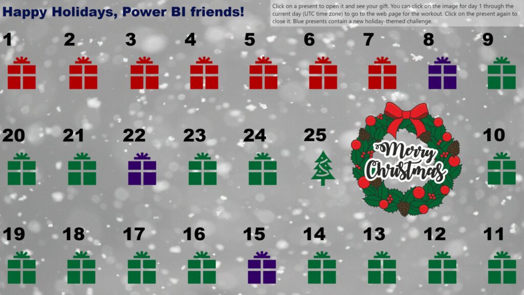
Author name: Meagan Longoria

Isotype visual showing female Nobel prize winners

2021 Week 24 | Power BI: Create an Isotype Visualization

Introduction This week we are continuing with the Nobel laureates data and taking a look at gender diversity of Nobel laureates. We’ll do this by using an isotype visualization. Isotype visuals use an icon that is related to the subject matter being depicted and often use multiples to represent quantitative data. You can learn more about […]

2021 Week 24 | Power BI: Create an Isotype Visualization Read More »

2021 Week 22 | Power BI: Create Your Own Timeline from JSON Data

Introduction Workout Wednesdays for Power BI is now in our sixth month! Thanks so much for joining us. For the month of June, we will have independent exercises that all use the same data source but focus on different aspects of the data and of Power BI. Our dataset for the month comes from Nobelprize.org.

2021 Week 22 | Power BI: Create Your Own Timeline from JSON Data Read More »

2021 Week 10 | Power BI: Violin Plot Custom Visual

Introduction Thanks for joining us for Week 10 of Workout Wednesday – Power BI Edition.  This week our challenge is to use the Violin Plot custom visual. There are no dependencies on prior weeks for this workout, so feel free to jump right in.  Custom visuals are additional visuals created by Microsoft and Microsoft partners

2021 Week 10 | Power BI: Violin Plot Custom Visual Read More »