
Introduction
Here we go! This is the second installment of our new “dashboard series” that Erica started last week. My challenge will build upon what she built. If you participated last you can start from that there, if you haven’t started yet, you can check out her challenge here and then come back when you’re done…or if you’re looking for a starting point, then you can grab a copy of Erica’s workbook of her Tableau Public page.
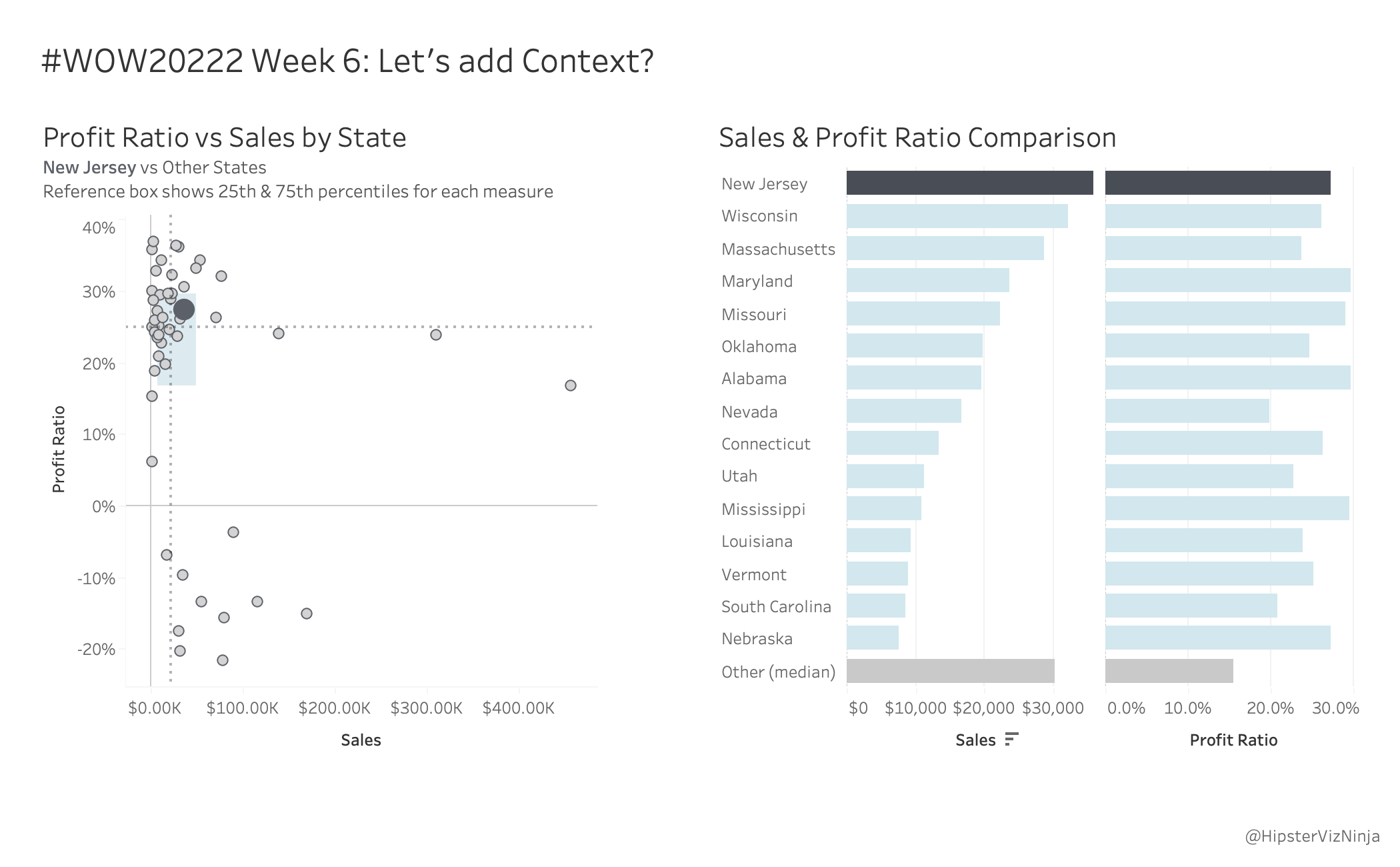
But here’s my challenge – in my experience, when you create a scatterplot in a business dashboard, it is imperative that you also provide a view that gives context and detail because scatterplots can be confusing to many. So that’s what we’re going to do.
Requirements
- Dashboard Size: 1050 x 650px
- 2 sheets
- In addition to last week’s scatterplot
- Add a bar chart that shows
- Selected State
- Any non-selected states in the reference box
- All non-selected states outside the reference box
- The outlier bar value(s) should be the aggregate median
- The bars should be sorted in this order
- Selected State
- Reference Box States
- Outlier States
- Match tooltips & formatting
Dataset
This week uses Superstore from 2021.4. You can find it here on Data.World
Attribute
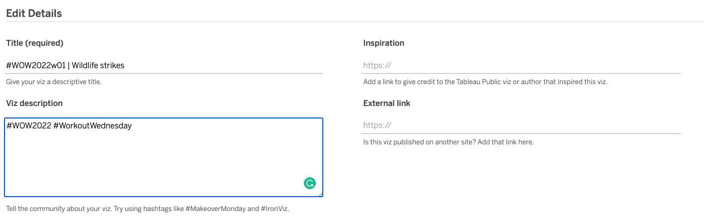
When you publish your solution on Tableau Public make sure to take the time and include a link to the original inspiration. Also include the hashtag #WOW2022 in your description to make it searchable!
Share
After you finish your workout, share on Twitter using the hashtag #WOW2022 and tag @LukeStanke, @_Lorna_Brown, @HipsterVizNinja, @_hughej, and @YetterDataViz