Introduction
This challenge comes straight from real-world work once again. The ask was simple: make both the count and its share easy to read, even if it requires scrolling.
This design didn’t make the final cut, but it’s one of my personal favorites.
Use this as a chance to deepen your understanding of what bar charts can do!
Requirements
- Sheets: 1
- Dashboard size: 1600 x 900px
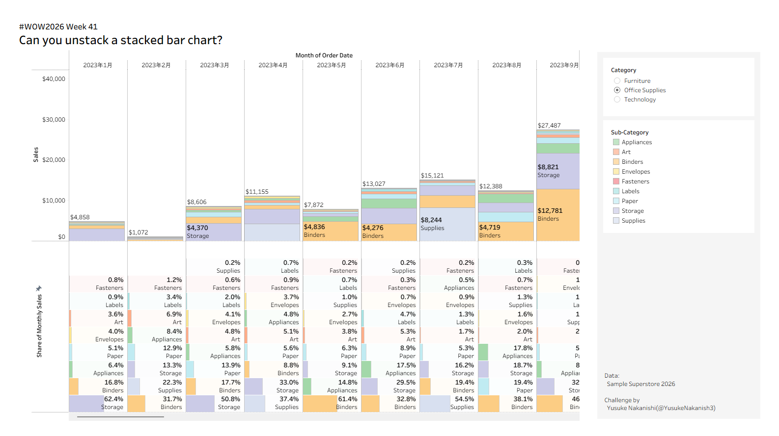
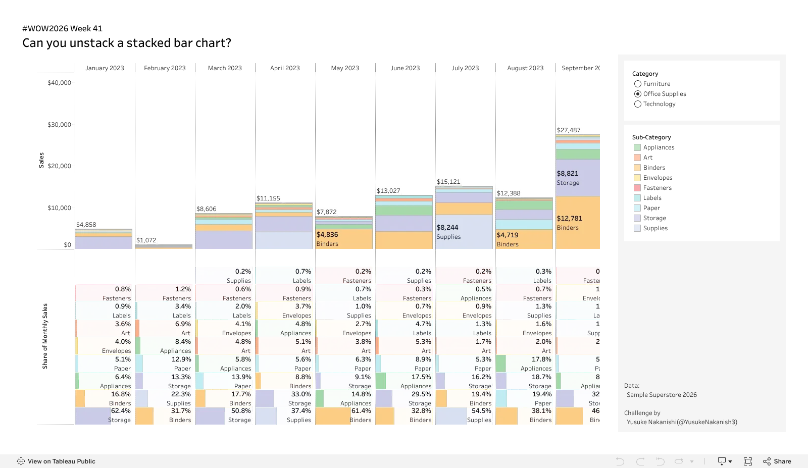
- Top: Build a stacked bar chart of Sales by Sub-Category for each month of Order Date.
- Show the total monthly Sales above each bar.
- Label the segments with Sub-Category and Sales.
- Bottom: Build horizontal bars showing each Sub-Category’s share of total monthly Sales.
- Label each bar with Sub-Category and % of Total Sales.
- shade each row’s background with a light tint of its Sub-Category color so that small shares are easier to see.
- In both sections, sort Sub-Categories by monthly Sales, with the largest at the bottom.
- Add a Category filter.
- Colors and formatting are up to you.
- Sorting a stacked bar chart: check out this post and past challenges like WOW2024 Week 12.
- Combining vertical stacked bars and horizontal bars in a single sheet: the key is sizing bars by a measure. See this post and WOW2020 Week48.
Dataset
This challenge uses the Sample Superstore 2026.2. You can download the data here (GitHub).
Attribute
When you publish your solution on Tableau Public make sure to take the time and include a link to the original inspiration. Also include the hashtag #WOW2026 in your description to make it searchable!
Share
After you finish your workout, share on X and/or LinkedIn using the hashtag #WOW2026 #Tableau and tag @WorkoutWednsday. Also, come join us in the Workout Wednesday channel on the Tableau Community Slack!