Introduction
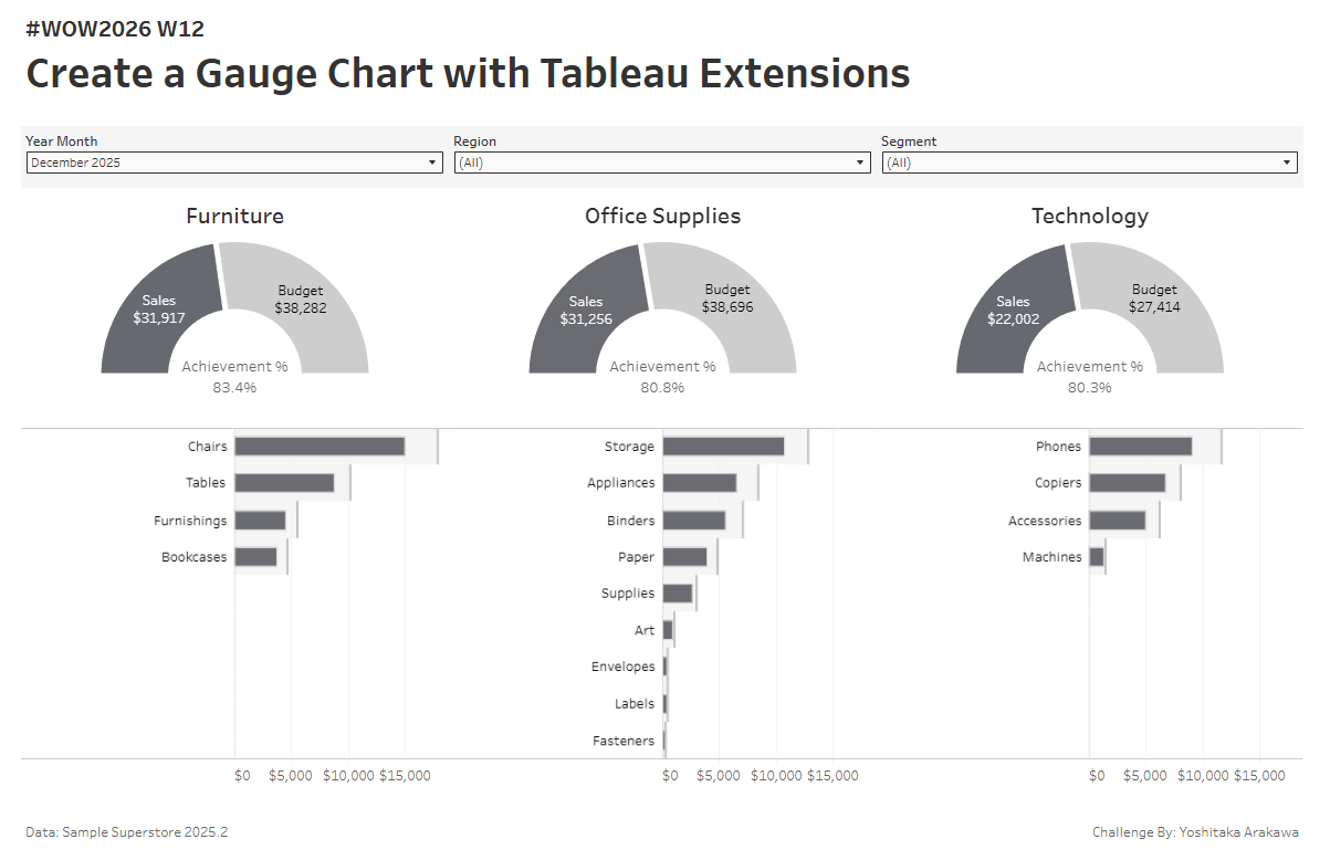
I was recently looking into the Radial Viz Extension after Sunburst support was added in Tableau 2025.3, and realized it can also create gauge charts with ease. Turns out this has actually been possible since the Radial Extension first launched in 2024.2!
Building gauge charts in Tableau used to require map layers and dedicated data preparation, which made them quite tricky. With the Radial Extension, it’s much simpler. I thought that was worth sharing as a WOW challenge. Even if you haven’t worked with Extensions before, this is a great one to get started with. Give it a try!
Requirements
- Dashboard size: 1200 x 800
- Any number of sheets
- Use Sample Superstore data joined with the provided budget data (see the Data section)
- Create 3 gauge charts (Furniture / Office Supplies / Technology) using the Radial Viz Extension, showing Achievement %
- Show Sales by Sub-Category as a bar chart for each Category, with Budget as a reference line
- Add filters for YearMonth, Region, and Segment
- Match the tooltips and formatting as closely as possible
Hint
-
If you need help getting started with the Radial Viz Extension, check out this walkthrough:
Dataset
This challenge uses Sample Superstore 2025.2 data and a dummy budget data . You can download the data here (Google Drive).
Attribute
When you publish your solution on Tableau Public make sure to take the time and include a link to the original inspiration. Also include the hashtag #WOW2026 in your description to make it searchable!
Share
- On X using the hashtag #WOW2026 #Tableau and tag @WorkoutWednsday and @yoshi_dataviz
- On LinkedIn using the tag Workout Wednesday, Tableau, and Yoshitaka Arakawa
