Introduction
The other day, at the Hokuriku Tableau User Group, I had the opportunity to talk all about trellis charts with a room full of practitioners—covering everything from the basics and handling missing values to the aspect ratio of individual line chart panels, and more.
This week’s challenge features trellis charts as its theme once again, but I’ve added a few elements I haven’t asked for before.
I’m sure these techniques will come in handy in your everyday work, so I hope you enjoy the challenge!
Requirements
- Dashboard size: 1000 × 800
- Number of sheets: 1
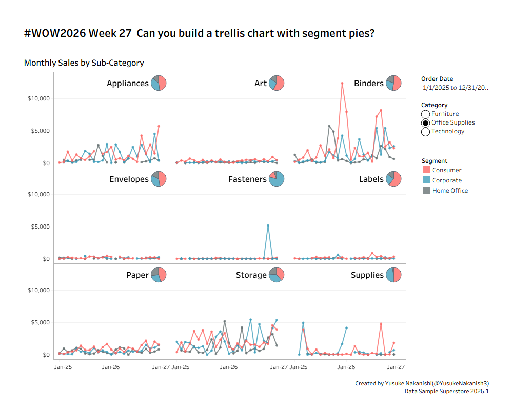
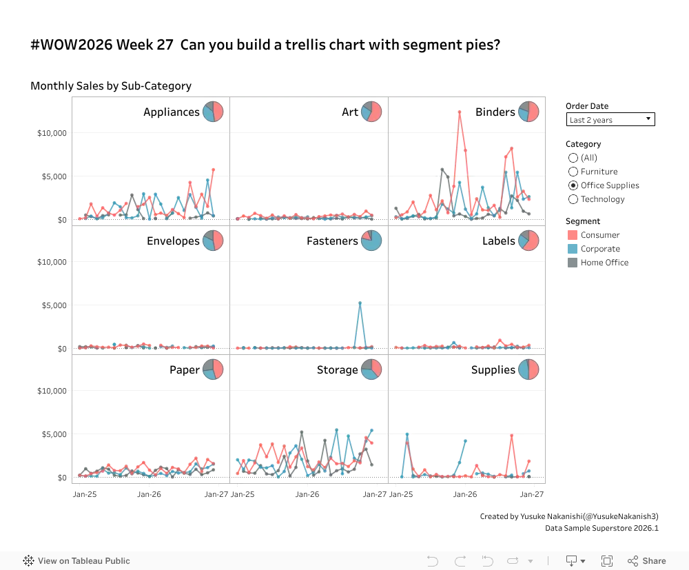
- Build a line chart of Sales by month covering 2025 and 2026
- Color the lines by Segment
- Turn it into a trellis chart broken out by Sub-Category
- Display the Sub-Category name in the top-right of each panel
- To the right of the Sub-Category name, add a pie chart showing each Segment’s share of that Sub-Category’s total Sales across 2025–2026
- Sort each pie’s slices from the largest Segment share to the smallest, within each Sub-Category (Fasteners is an easy one to check)
- Clicking a pie slice or a line should highlight that Segment across the entire view
- Colors and fonts are up to you
Dataset
Attribute
When you publish your solution on Tableau Public make sure to take the time and include a link to the original inspiration. Also include the hashtag #WOW2026 in your description to make it searchable!
Share
After you finish your workout, share on X and/or LinkedIn using the hashtag #WOW2026 #Tableau and tag @WorkoutWednsday. Also, come join us in the Workout Wednesday channel on the Tableau Community Slack!