Introduction
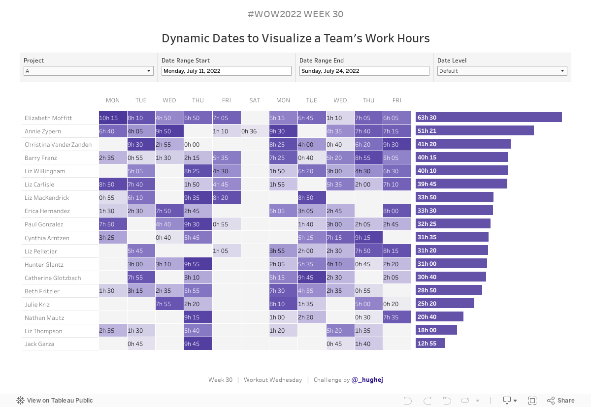
I’ve been wanting to create this challenge for some time, so I’m really glad to finally be releasing it. This challenge was inspired by some work I did last year where a client wanted to be able to visualize the number of hours that their team had spent working on different projects.
What made this visual really useful was how dynamic it was. The heatmap changes based on the date range selected by the user. If they select a smaller date range, the heatmap shows you the number of hours worked by Day. However, if the user wants to “zoom out” and look at a larger date range then the display will show them the aggregate hours by Weeks or Months.
What if the user isn’t happy with the Default view? Well, we gave them the ability to override it and select their own Date Level.
In the original visualization, we even took things one step further using Parameters to swap the dimensions in the Rows and Set Actions to drill-down from one level to another. (I haven’t incorporated these, because it would take some time to build but I just want to highlight how far you can go with one “simple” chart and a whole lot of interactivity).
Enjoy!

Requirements
- Dashboard Size: 1200 x 800px
- 2 sheets
- Create a heatmap to show the number of hours/minutes worked per person in a specified Date Level (Days/Weeks/Months)
- Allow users to filter the dates by a specific Date Range
- Make the Date Level dynamic so that users can select from:
- Default, based on Date Range selected:
– For a Date Range less than 28 days aggregate by Days
– For a Date Range less than 90 days aggregate by Weeks
– Otherwise aggregate by Months - Days
- Weeks
- Months
- Filter by Project
- Format the Date Labels
- Format the Time to display as Hours + Minutes, e.g.: 185 should display as 3h 05
- Create a bar chart for the Total Hours per person (within the selected date range)
- Sort both charts by Total Hours in descending order
- Match tooltips and formatting
Dataset
This week uses a mock data set that was create especially for this challenge. You can find it here Data.World
Attribute
When you publish your solution on Tableau Public make sure to take the time and include a link to the original inspiration. Also include the hashtag #WOW2022 in your description to make it searchable!
Share
After you finish your workout, share on Twitter using the hashtag #WOW2022 and tag @LukeStanke, @_Lorna_Brown, @HipsterVizNinja, @_hughej, and @YetterDataViz
Solution
Interactive