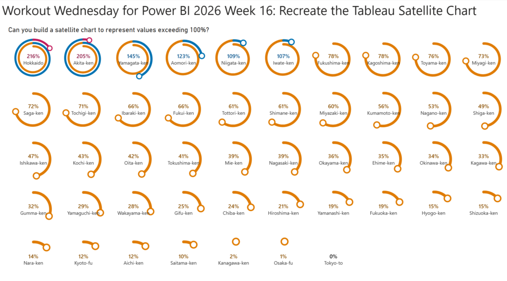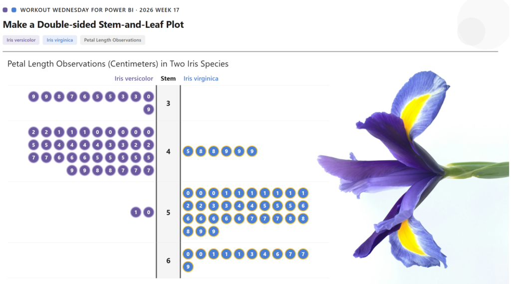
2026 Week 17 | Power BI: Create a Double-Sided Stem-and-Leaf Plot
Introduction Inspired by a previous Tableau challenge, we are making a double-sided stem-and-leaf plot, but we are using a different dataset and showing the observed petal length of two species of iris. A stem-and-leaf plot displays numerical data by splitting each value into a “stem” (leading digit) and a “leaf” (trailing digit), arranging them so […]
2026 Week 17 | Power BI: Create a Double-Sided Stem-and-Leaf Plot Read More »
Power BI, Workout Wednesday