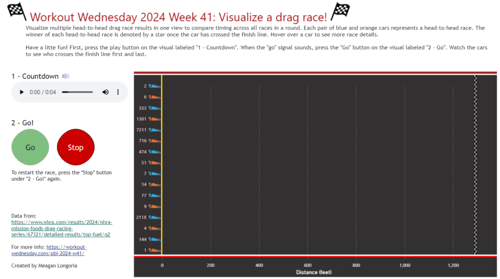
Power BI

scatterplot

2024 Week 42 | Power BI: Scatter Plot Dynamic Colour Density

Introduction Scatterplots are one of the most useful visual chart types for data exploration. You can use them to identify relationships among two or more variables, find clusters of data, encode data in several ways for communicating insights etc. This is especially useful when working with large datasets. In this WoW challenge, our goal is to use marker […]

2024 Week 42 | Power BI: Scatter Plot Dynamic Colour Density Read More »

2024 Week 40 | Power BI: #FabConEurope Edition – Contest Deadline Extended!

Introduction Welcome back to Workout Wednesday. This week we’re extending the #FabConEurope edition of Workout Wednesday. We’re hosting a contest and three winners will receive a 30-minute one-on-one mentoring session with one of the three Workout Wednesday hosts. For more information on how to enter, see contest details below. Requirements   Get and transform data Get

2024 Week 40 | Power BI: #FabConEurope Edition – Contest Deadline Extended! Read More »

2024 Week 39 | Power BI: #FabConEurope Edition

Introduction Welcome back to Workout Wednesday. This week we’ve got a special #FabCon Edition of Workout Wednesday. We’re hosting a contest and three winners will receive a 30-minute one-on-one mentoring session with one of the three Workout Wednesday hosts. For more information on how to enter, see contest details below. Requirements   Get and transform data Get

2024 Week 39 | Power BI: #FabConEurope Edition Read More »

2024 Week 37 | Power BI: Create a Report with Light and Dark Mode

Introduction In honor of the Power BI Desktop dark mode being scheduled for public preview this month, we are making a report that allows you to switch between light mode and dark mode.  Requirements Get the data from Data.World.  Filter the report to the year 2024. Create a card that shows current year sales. Create

2024 Week 37 | Power BI: Create a Report with Light and Dark Mode Read More »

2024 Week 36 | Power BI: Recreate a NYT Interactive Article

Introduction Welcome back to Workout Wednesday. This week we’re taking inspiration from the incredible infographics team over at the New York Times. Their 2015 article looks at the average American’s contribution to the drought in California. As of today (Sep 2024), about a third of California remains abnormally dry. This challenge features some fun data work

2024 Week 36 | Power BI: Recreate a NYT Interactive Article Read More »

2024 Week 35 | Power BI: Overlapping histogram with normal distribution curve

Introduction Overlapping histograms with normal curve overlays are used to compare the distribution of a numerical variable across different groups such as male and female body mass. With this we can glance the central tendency, spread, and skewness of the data within each group and also how well the data follows a normal distribution. The

2024 Week 35 | Power BI: Overlapping histogram with normal distribution curve Read More »

2024 Week 34 | Power BI: Visual Calcs and Parameters

Introduction This week’s challenge is provided by guest contributor Erik Svensen https://www.linkedin.com/company/catmansolution. The workout will use visual calculations in combination with numeric parameters to highlight a period in a development chart. (Please note visual calculations do not currently publish to web) Requirements 1. Retrieve the data from Google Sheets – (you only need orders)2. Add

2024 Week 34 | Power BI: Visual Calcs and Parameters Read More »

2024 Week 33 | Power BI: Segmented Donut Chart

Introduction Editor’s note: This week we have a guest post from Imran Haq (LinkedIn, X). If you haven’t already, try out his previous WoW contribution to make a jittered column chart.  The segmented bar chart from week 29, inspired some experimentation with similar designs. This week we are making segmented donut charts. These donut charts have 2

2024 Week 33 | Power BI: Segmented Donut Chart Read More »