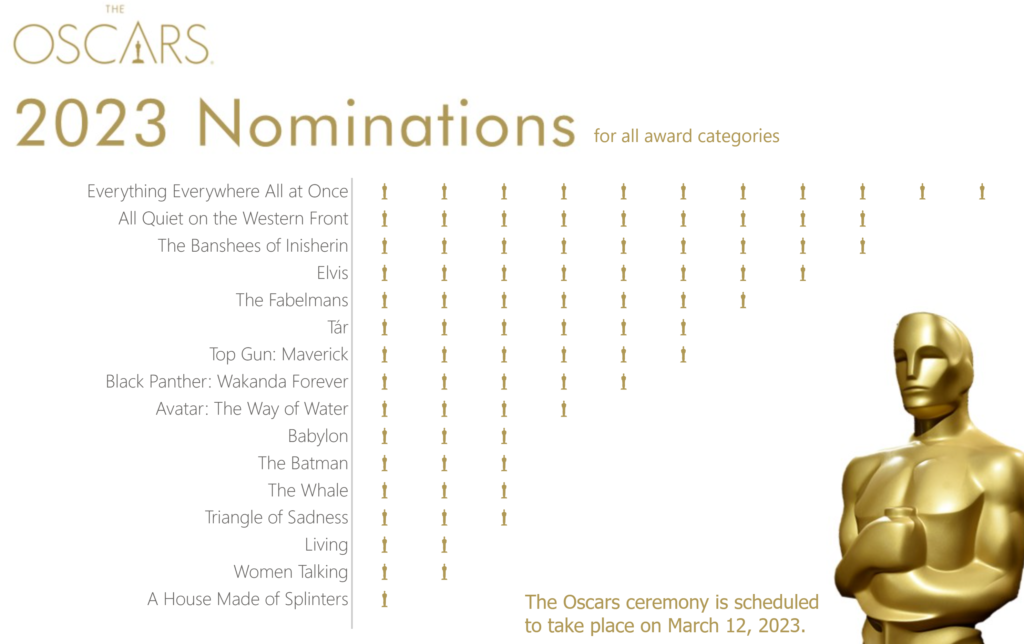
2023 Week 05 | Power BI: Visualize the Oscars with an Isotype/Pictogram Chart
Introduction Hello and welcome back to Workout Wednesday! If you’re joining us for the first time, be sure to check out our complete list of challenges. This week we’re looking at data from the American Academy Awards, also known as the Oscars. The Oscars are awards for artistic and technical merit for the American film industry […]
2023 Week 05 | Power BI: Visualize the Oscars with an Isotype/Pictogram Chart Read More »