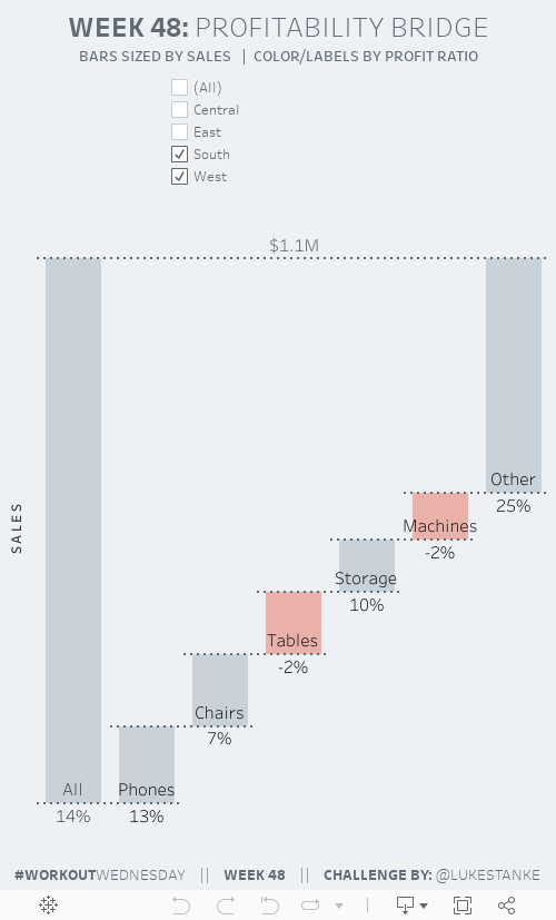
This week we’re building a chart I was asked to create at work. A stakeholder drew this exact chart type and said, “make the chart look exactly like this!” At first glance I wasn’t sure I would be able to do it. After a little playing around I was able to re-create it!
Challenge
Click to view on Tableau Public
Requirements
- Dashboard size is 500px wide by 800px tall.
- Create a waterfall chart showing the top 5 sub-categories by sales. Include an other category for all other categories.
- Show a bar on the far-left of the waterfall that shows all sub-categories. Label it all.
- Add dashed lines that “connect” each bar.
- Add a dashed line that connects the All bar with the Other bar.
- Make sure each line looks as a single continuous dashed line. Watch your padding and axis label width!
- Label each sub-category above the bottom line of each bar.
- Label each bar with the profit ratio below the bottom line of each bar.
- Add a filter by region. Make sure the filter is centered on the dashboard above the chart.
- Color the bar gray if it above zero (#ACBAC3) or pink if it is below zero (#E48070).
- Match tooltips.
Dataset
This week uses the superstore dataset for Tableau 2018.3. You can get it here at data.world
Share
After you finish your workout, share on Twitter using the hashtag #WorkoutWednesday2018 and tag @AnnUJackson, @LukeStanke, @lorna_eden, @curtisharris_, @RodyZakovich, and @VizWizBI!
Track your progress
Also, don’t forget to track your progress using this Workout Wednesday form.