Introduction
For this week’s community challenge, I am drawing inspiration from this blog post by fellow Ambassador and new Visionary, Johan de Groot.
I’ve had radar charts on my back-burner for some time, but never got round to putting out as a challenge, as felt they may seem ‘too fiddly’. But Johan shared a ‘map layered’ solution which I felt compelled to try.
Like parallel coordinates charts, radar charts provide a method for comparing multiple numerical measures in a single view; this time in a more circular fashion. It might be considered a niche chart type, but it’s always useful to have in your ‘toolbox’ as an option
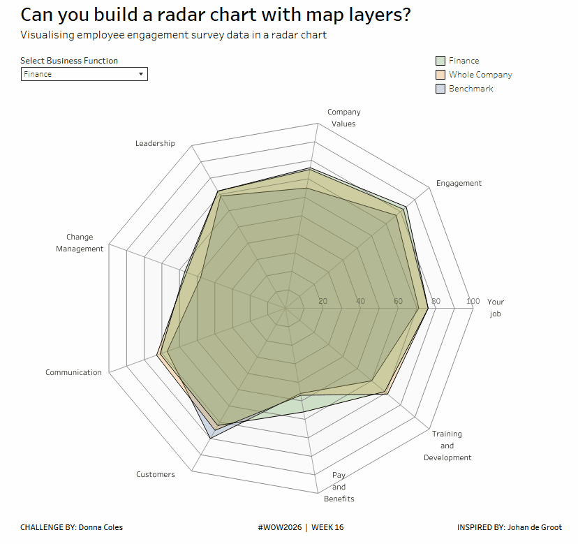
For this example I’m using manually curated data to visualise employment engagement survey data. The data set includes % results for a set of key ’employee satisfaction’ themes for departments in a business. Data for an external ‘benchmark’ and average scores for the whole company are also included.
There are 2 parts to the this challenge. Each challenge will require a slightly different data set that is provided.
– the core challenge : to build a ‘filled’ radar chart
– bonus challenge : to build an unfilled radar chart.
Requirements
Core Challenge
- Dashboard 800 x 800
- model the data to combine the data from the Engagement Survey Data – Filled sheet with the Gridlines sheet
- display a filled area radar chart that compares a selected business area to the benchmark and the whole company data
- include spokes, gridlines, theme labels, and axis labels
- match tooltips, colour as desired
- use Johan’s excellent blog post to help guide you through 🙂
Bonus Challenge
Identifying the different business areas being compared may not be ideal (layered colours don’t match the legend etc), so an alternative is use a non-filled option
- Dashboard 800 x 800
- model the data to combine the data from the Engagement Survey Data – Line sheet with the Gridlines sheet
(NOTE the data in this sheet has an extra ‘dummy’ theme whose values all match to the data associated to the records with Theme ID = 1. This is necessary for the line to ‘join up’) - display a non-filled radar chart that compares a selected business area to the benchmark and the whole company data
- include spokes, gridlines, theme labels, and axis labels
- adjust calculations as required to accommodate the additional dummy record
- match tooltips, colour as desired
Dataset
Available from here.
Attribute
When you publish your solution on Tableau Public make sure to take the time and include a link to the original inspiration. Also include the hashtag #WOW2026 in your description to make it searchable!

Share
After you finish your workout, share on Twitter and/or LinkedIn using the hashtag #WOW2026 #Tableau and tag @WorkoutWednsday
Solution
Interactive
