
Introduction
A profit card tells you the result. It does not show how that result is built, which components changed, or where to investigate next.
This week, build an interactive Financial Metric Map in Power BI. Start with Net profit and reveal its components one branch at a time: revenue, cost of goods sold, operating expenses, interest and tax. Continue down to order volumes, basket size, unit economics, discounts and returns.
The goal is not to put more KPI cards on a page. It is to connect each number to its calculation and comparison. A reader should be able to follow a change in profit down to a smaller, understandable component, inspect the formula, and compare the same structure across countries and years.
I built the example with the free HTML Content custom visual. DAX supplies the values and comparisons; HTML and CSS provide the expandable tree, connectors and explanations. No external JavaScript, images or remote assets are required. You may use any visual approach that fulfils the requirements.
The Metric Map
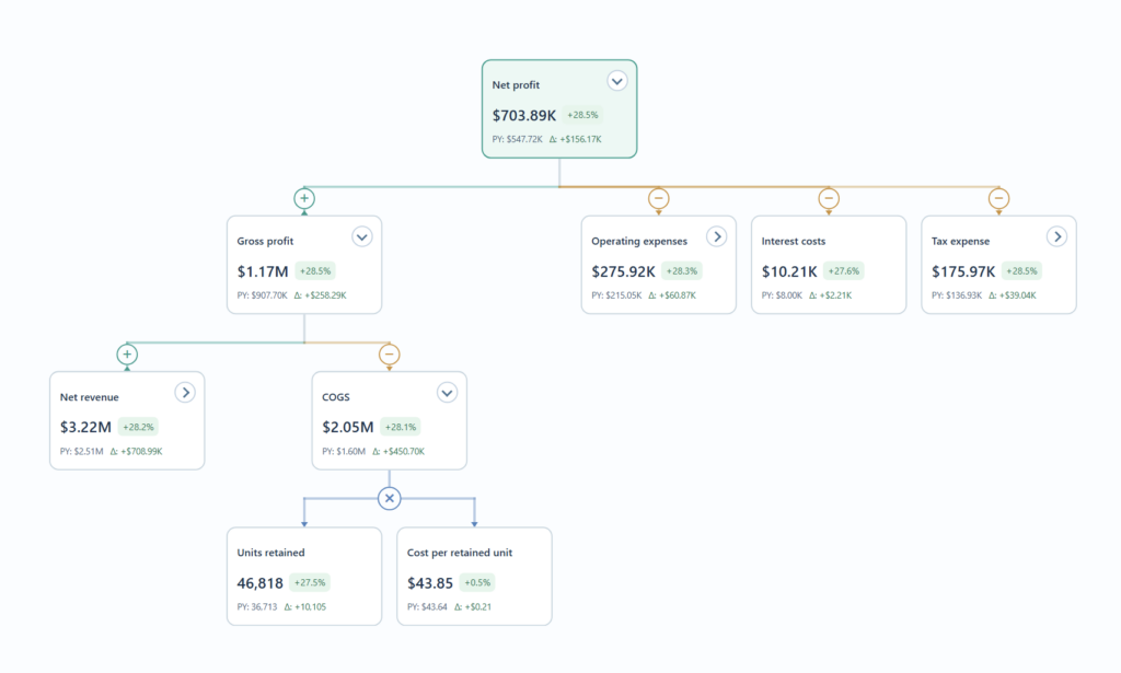
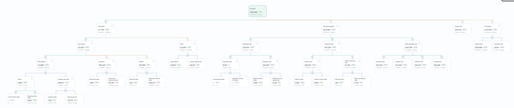
The map follows calculations from outcomes to their components. Use these relationships as the backbone:
- Net profit = Gross profit − Operating expenses − Interest costs − Tax expense.
- Gross profit = Net revenue − COGS.
- Net revenue = Sales baseline − Discounts − Refunds.
- Sales baseline = Orders × Average order value.
- Orders = First-purchase orders + Repeat-purchase orders.
- Average order value = Units per order × Revenue per unit.
- COGS = Units retained × Cost per retained unit.
- Operating expenses = Marketing costs + Fulfilment costs + Other operating costs.
Continue the expense branches into acquisition and retention, delivery and return handling, and personnel, facilities, software and payment fees. Discounts and refunds break down into the number of affected orders multiplied by the average adjustment per affected order. Tax expense breaks down into Taxable profit × Income tax rate.
This is a calculation map, not a loop of equivalent formulas. Do not expand Gross profit back into Net profit, or a unit-cost ratio back into its parent total. Stop at an input or a clearly defined measure. A shared measure may appear in more than one branch when the calculation needs it, but never as its own ancestor.
Requirements
Requirements
- Import and model the Sales Orders, Customer, Product and Location data. Use the supplied financial assumptions and order rules for the additional revenue adjustments and expenses.
- Create the measures needed for the map. Count each multi-item order once, using Order ID, Order Date, Customer ID and Location ID together. Calculate averages from their totals and denominators in the active filter context.
- Build one connected tree with Net profit as the root. Include the revenue and expense branches described above. Keep multiplication inside its actual parent branch rather than in a separate diagram.
- Allow readers to expand and collapse individual branches by clicking a card or its chevron. Keep disclosure controls visually distinct from calculation operators.
- Use green connections with + for added components and amber connections with − for subtracted components. For multiplication, use a blue connection with one circular × junction below the parent and two factors below it. Do not rely on colour alone.
- Show two compact comparison rows on every card: current value followed immediately by percentage change; then PY followed immediately by absolute Δ. Use appropriate currency, count, ratio or percentage formatting.
- Compare the selected calendar year with the immediately preceding calendar year, preserving the same Country filter. Calculate absolute change as Current − PY and percentage change as (Current − PY) / |PY|. Use percentage-point change for percentage measures.
- Colour positive changes green and negative changes red. These colours indicate numeric direction, not whether the change is beneficial: an increase in a cost is still a positive numeric change. Show unavailable comparisons and zero-denominator percentages neutrally, without inventing a zero.
- On hover or keyboard focus, show the formula first, followed by the metric definition and, for child nodes, its signed contribution to the parent’s change. Use a separate blue hover treatment rather than changing the card to green.
- For addition and subtraction, calculate contribution as the signed child change. For a product A × B, use a midpoint split: contribution from A = ΔA × (B current + B PY) / 2; contribution from B = ΔB × (A current + A PY) / 2. The two contributions must reconcile to the parent change.
- Add native Year and Country slicers, plus Overview, Expand all and Collapse all controls. Overview opens a small starting path; Expand all reveals every branch; Collapse all leaves the root card. Filters must recalculate current values, prior-year values and contributions throughout the map.
- Keep the map usable when fully expanded. Provide scrolling and Zoom options, keep cards compact, and centre the collapsed tree. The example uses a 2000 × 1200 report page and Zoom levels of 100%, 75%, 50% and 35%. Use static, thin connections; moving particles are not required.
- Place the selected year comparison, country scope and a short PY/Δ legend outside the tree. Explain that signed contributions reconcile the calculation; they do not establish a business cause.
Optional stretch goal: separate the map definition from the renderer. Configure labels, measure bindings, units, formulas, descriptions and child operators in JSON, validate the relationships, and compile the configuration into the Power BI HTML measure. This is an authoring workflow, not a live JSON import or an end-user metric editor.
How to use it
Start with Net profit and its year-over-year change. Open the first level and inspect the contributions from Gross profit, Operating expenses, Interest costs and Tax expense. Follow the branch you want to understand: for example, Net revenue leads to sales, discounts and refunds; sales then separates order volume from average order value.
Change Country to inspect the same calculation for a different population. Hover a component to check its definition and contribution before drawing a conclusion. The map helps you decide what to investigate next; explaining why orders, prices or costs changed still requires supporting business evidence.
Dataset
Find this week’s dataset in Excel at: Workspaces / Workout Wednesday / 2026 / 2026W40 – Sales
Share
After you finish your workout, share on Bluesky or LinkedIn using the hashtags #WOW2026 and #PowerBI, and tag @MMarie, @shan_gsd, @KerryKolosko.