Introduction
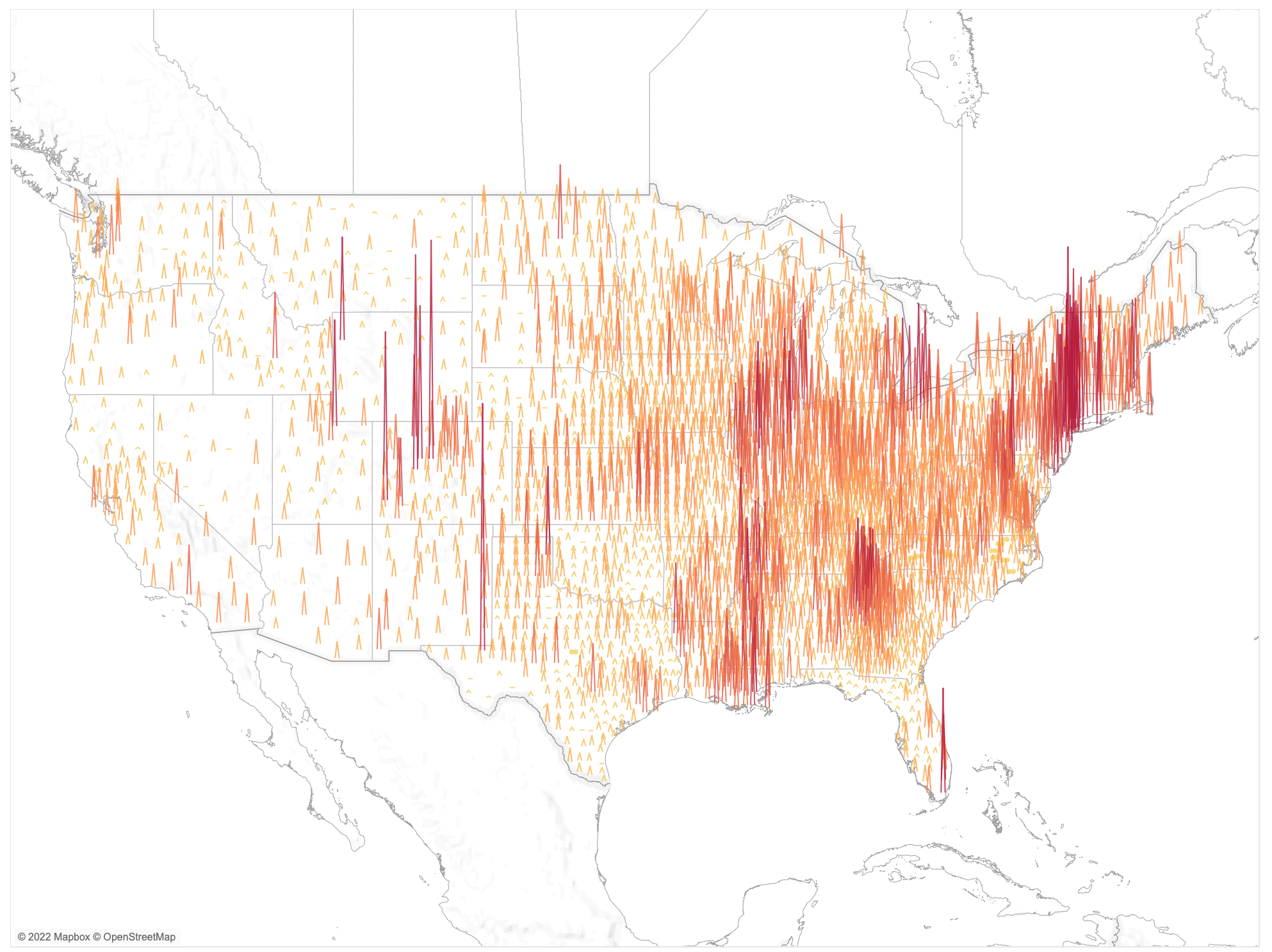
This week we’ll look back at COVID-19 cases in the continental United States on December 30th, 2021. In this challenge you will use data from covidactnow.org to show where cases were most prevalent in terms of cases per 100,000.
The data for this challenge are already pre-loaded in a workbook. They include the COVID-19 data as well as a logical join to a secondary data set that will allow you to figure out how to create the map.
Requirements
- Dashboard Size: 1000px by 800px
- 1 of Sheet
- Use Point, Clat10, Clon10, and metrics.caseDensity to create points for the map.
- Make the pyramids .2 longitude units wide.
- Make the pyramid height to be 1/60 of a latitude unit for every case per 100,000 residents.
- Order the pyramids so the lowest latitudes sit on top of the marks with higher latitudes
- Set the colour using case density. Set the start at 0, the middle at 75, and the end at 200. Use the Red-Gold color palette.
- Match the formatting (map, marks, tooltips)
Dataset
Download the .twbx with modeled data from this Google Drive. Or if you have Tableau Public, download the .hyper file from the /Data folder.
Attribute
When you publish your solution on Tableau Public make sure to take the time and include a link to the original inspiration. Also include the hashtag #WOW2022 in your description to make it searchable!
Share
After you finish your workout, share on Twitter using the hashtag #WOW2021 and tag @LukeStanke, @_Lorna_Brown, @_hughej, @YetterDataViz and @HipsterVizNinja