Introduction
Color has meaning in data visualization. If you’ve ever viewed or created a choropleth map, you’re familiar with encoding data so that different colors in geographic areas represent different values. While a map is not an appropriate visual for all geographic data–and there are certainly problems with area-based representations–Power BI has numerous ways to try to visually map out your data. Let’s consider one today, but with a twist!
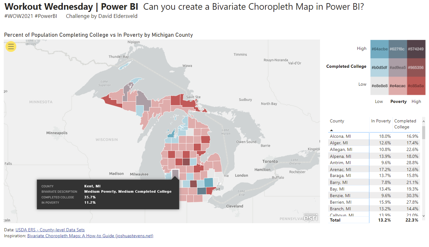
Typical choropleth maps represent a single measurement and have a color scale that manages a single spectrum of values. With this challenge, you need to use your Power BI skills to bin data into low/medium/high buckets, but you need to do so with two separate variables. You will then create a measure that combines your bins for both variables so there are now nine (3×3) possible options instead of only three.
Note that there are some limitations around using ArcGIS Maps for Power BI with the “Publish to Web” feature (Publish to web—ArcGIS for Power BI | Documentation), so your final map should look similar to the static image below.

I’ve also embedded a Publish to Web version with the native Filled Map, which doesn’t appear as stunning compared to ArcGIS. For interactivity and a tooltip demo for you, it gets the job done. It’s not as crisp or elegant though. Have you caught on that I prefer the ArcGIS map over the Filled Map yet? If the situation is right, you can do this challenge and so much more with ArcGIS Maps for Power BI.
Requirements
- Read about key concepts behind Bivariate Choropleth maps first: Bivariate Choropleth Maps: A How-to Guide (joshuastevens.net)
- This challenge’s data is already based on percent of population, so don’t worry about normalizing on top of what is provided
- Select a color scale from among the article’s sample options
- In Power Query, merge the two datasets together on FIPS
- In Power Query, cleanup, transform, and add columns as needed to get data into shape
- Hint: You’ll need at least a County column as well as two that I called In Poverty and Completed College that contain numeric data
- After loading the data into your data model, add separate Bins for In Poverty and Completed College
- Note that this could be manually done in Power Query as well, but this demonstrates Power BI’s Groups/Bins feature as well as is easier to work with visually in the UI
- Create a measure that combines the 3×3 combination of values (9 total options)
- Hint: Use the DAX SWITCH function and combine with SELECTEDVALUE. Look at past WOW challenges for help with SWITCH as well. You should end up with nine conditions to match the nine bivariate options.
- Use ArcGIS Maps for Power BI
- Note that some organizations may disable this particular map, in which case you could use the Filled Map as an alternative
- Create a choropleth map using Location (County) and Color (your measure)
- Find and set the map colors to your chosen color scale in the Symbology section
- Mind the map’s tooltip
- Mind the data formatting for percentages
Dataset
This week uses two separate tables available in the same dataset from data.world. Originally sourced from the US Department of Agriculture website, it contains data for Michigan’s 83 counties for % of population in poverty and % of population who have completed a college education.
Use Power BI’s native data.world connector to import both the poverty_2019 table and the percent_college_completion table, which you then must join together in Power BI’s Power Query Editor.
WOW2021week15 – dataset by dataveld | data.world
Owner: dataveld
Dataset: wow2021week15
Share
After you finish your workout, share on Twitter using the hashtags #WOW2021 and #PowerBI, and tag @JSBaucke, @MMarie, @shan_gsd and @dataveld. Also make sure to fill out the Submission Tracker so that we can count you as a participant this week in order to track our participation throughout the year.


Hi David, the data.world link seems to be broken.
Thanks! The link should work for everyone now if logged into data.world.
Thanks! It’s working fine now 🙂
Lol – I’m dying here.
Solution video is up!
Why do you set your poverty limits at 0.05, 0.41, and 0.18? The bin boundaries for poverty is 0.1, 0.397, and 0.693?
The column from example step generates a bin boundaries error in the solution. If you check “Barry, MI” for example, you can see that it will generate 0.78 instead of 0.078 (so basically in the model there will be 78% poverty, in Barry while it should have been 7.8%). That’s also why the min and max will be different while Power BI is creating the bins and so will the boundaries. Hope that helps.
why did you use true() in switch
SWITCH(TRUE(),…) is a neater way to write a longer nested IF statements when the conditions test something other than equality (>, <, etc.)
Thanks.
18 months later you can set the colour directly with a measure.
The Argis map now does this in the same way as a Filled map.
Why does the filled map not show up when I load the “County”. It’s just blank. Have enabled filled map from settings and still the same. Does anyone know away out?
Hi Arch –
Have you applied a data category to the County field? In Power BI Desktop, you can ensure fields are correctly geo-coded by setting the Data Category on the data fields. In Data view, select the desired column. From the ribbon, select the Column tools tab and then set the Data Category to County. I hope that helps!