
Introduction
This week, we are utilising new features from the July 2026 Power BI update.
With this update, conditional formatting can be now be applied on graphs with a categorical legend.
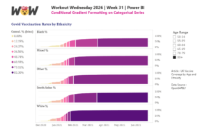
This weeks challenge will look to create a cumulative line graph of vaccination rates across population groups (either age or ethnicity), banded by % of total to make the comparison easier across groups.
Dataset
Requirements
-
obtain the Dataset and model the data to calculate cumulate % for each ethnicity (best done in Power Query), Pivot data so that ethnicity is its own field.
- create cumulative % bins (5, 6 or 8 bins)
- create an area graph with bins in the legend and Ethnicity by small multiple (this must have a slicer on age group to work)
- Conditionally format the bins in gradient colours from lowest bin to highest bin
Share
After you finish your workout, share on BlueSky or LinkedIn using the hashtags #WOW2026 and #PowerBI, and tag @MMarie, @shan_gsd, @merrykerry (on BlueSky).