I hope everyone enjoyed Community Month! I’m excited to be back and to share a fun challenge that highlights using pie charts (puns a plenty today!).
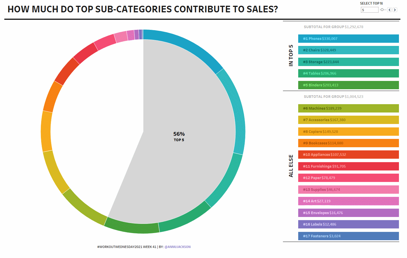
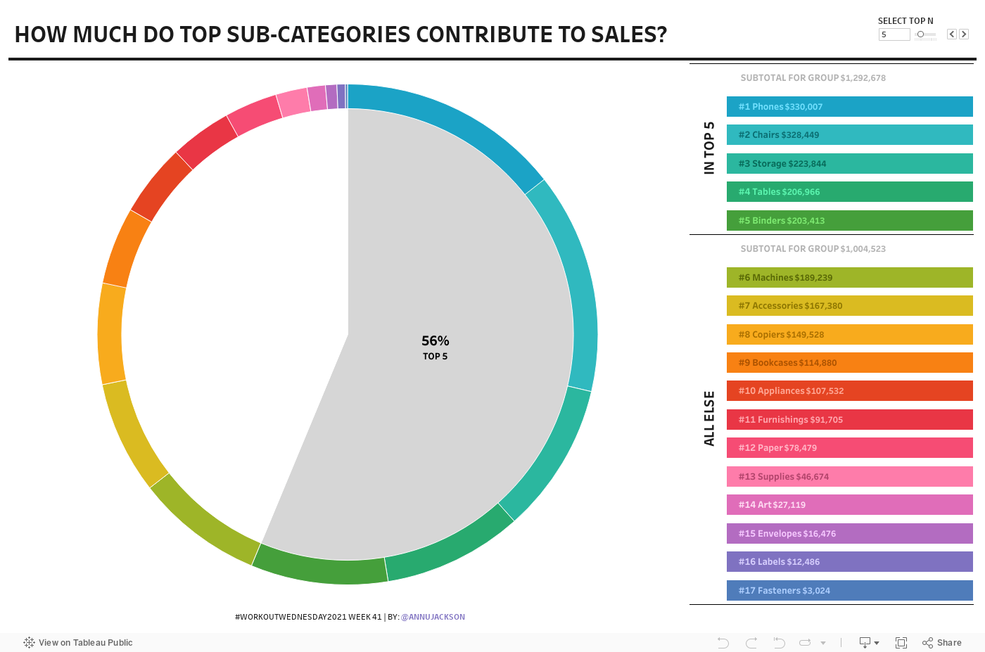
This challenge is based on a request from a sales team – they wanted to understand how individual accounts contributed to their overall revenue. The beauty of this is 3 fold: they get the comfort of a pie chart, there’s interactivity and customization to define a top N, and there’s also a highlight table (heavily inspired by Bridget Cogley) for those who are pie-chart adverse.
There are many details in this challenge, so while it may look easy, don’t overlook the smaller parts that contribute to the whole. 😉
Create a pie chart showing the proportion of sales by sub-category and the proportion of total for the Top N selected by the end user
Build a highlight table that groups together and sorts based on the Top N
Construct interactivity to highlight the Top N and non-Top N in both the pie chart and the highlight table
Match tooltips and formatting, pay particular attention to: mark labels, headers, and tooltips (color palette is Hue Circle, with Sub-Categories pre-sorted by Sales in descending order)
Dataset
This week uses the superstore dataset for Tableau 2020.3. You can get it here at data.world
Attribute
When you publish your solution on Tableau Public make sure to take the time and include a link to the original inspiration. Also include the hashtag #WOW2021 in your description to make it searchable!