Advanced

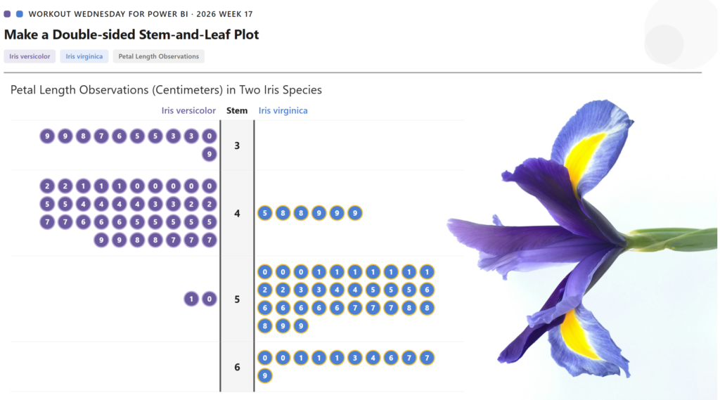
2026 Week 17 | Power BI: Create a Double-Sided Stem-and-Leaf Plot

Introduction Inspired by a previous Tableau challenge, we are making a double-sided stem-and-leaf plot, but we are using a different dataset and showing the observed petal length of two species of iris. A stem-and-leaf plot displays numerical data by splitting each value into a “stem” (leading digit) and a “leaf” (trailing digit), arranging them so […]

2026 Week 17 | Power BI: Create a Double-Sided Stem-and-Leaf Plot Read More »

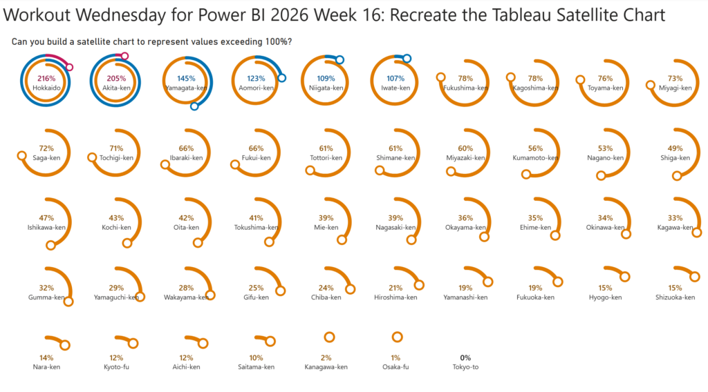
2026 Week 16 | Power BI: Recreate the Tableau Satellite Chart

Introduction This week, we are making a Power BI version of a previous Tableau challenge by Donna Coles. We are making small multiple spiral charts, also called satellite charts. Satellite charts can be used to show percentages when values exceed 100%. Rather than creating one circle like a donut chart, the line spirals out to

2026 Week 16 | Power BI: Recreate the Tableau Satellite Chart Read More »

Week 15

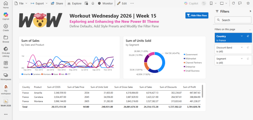
2026 Week 15 | Power BI: Exploring and Enhancing the new Theme

Introduction In this week’s challenge we are exploring the new Power BI Theme that is in Preview : https://powerbi.microsoft.com/en-us/blog/deep-dive-into-modern-visual-defaults-and-customizing-theme-improvements-preview/   The new theme comes with new chart defaults and additional Style Presets.   The challenge is to set your own defaults by downloading the JSON Theme file and modifying it.   You can use a

2026 Week 15 | Power BI: Exploring and Enhancing the new Theme Read More »

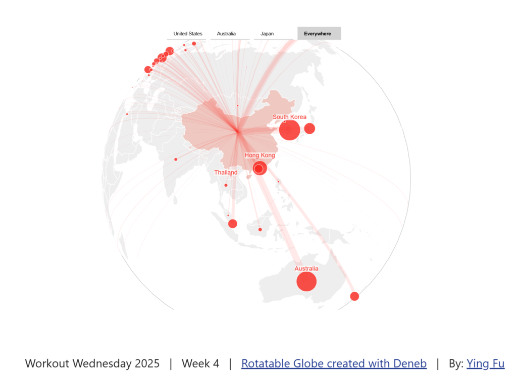
Screenshot of a globe created using Deneb in Power BI

2025 Week 4 | Power BI: Create a Rotatable Globe with Deneb by Ying Fu

Introduction Welcome back to Workout Wednesday! This week we’re having fun with the Deneb custom visual and learning from another one of our fabulous Power BI community members, Ying Fu. Ying has been sharing on LinkedIn and I’ve had so much fun exploring their GitHub repo. Today we’re using a rotatable globe to look at Chinese migration abroad. Ying

2025 Week 4 | Power BI: Create a Rotatable Globe with Deneb by Ying Fu Read More »

Radial Plots

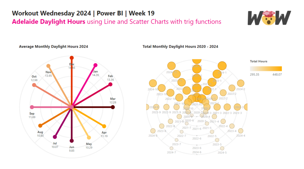
2024 Week 19 | Power BI: Radial Plots using Line and Scatter Charts with trig functions

Introduction In this week’s challenge, we are experimenting with Radial Plots using Line and Scatter Core Visuals. Radial Lollipop charts are an alternative to radar charts. Power BI does not have Polar Plots, only cartesian plots, so we will need to use trigonomic functions within DAX to calculate the cartesian X and Y position of points. Requirements

2024 Week 19 | Power BI: Radial Plots using Line and Scatter Charts with trig functions Read More »