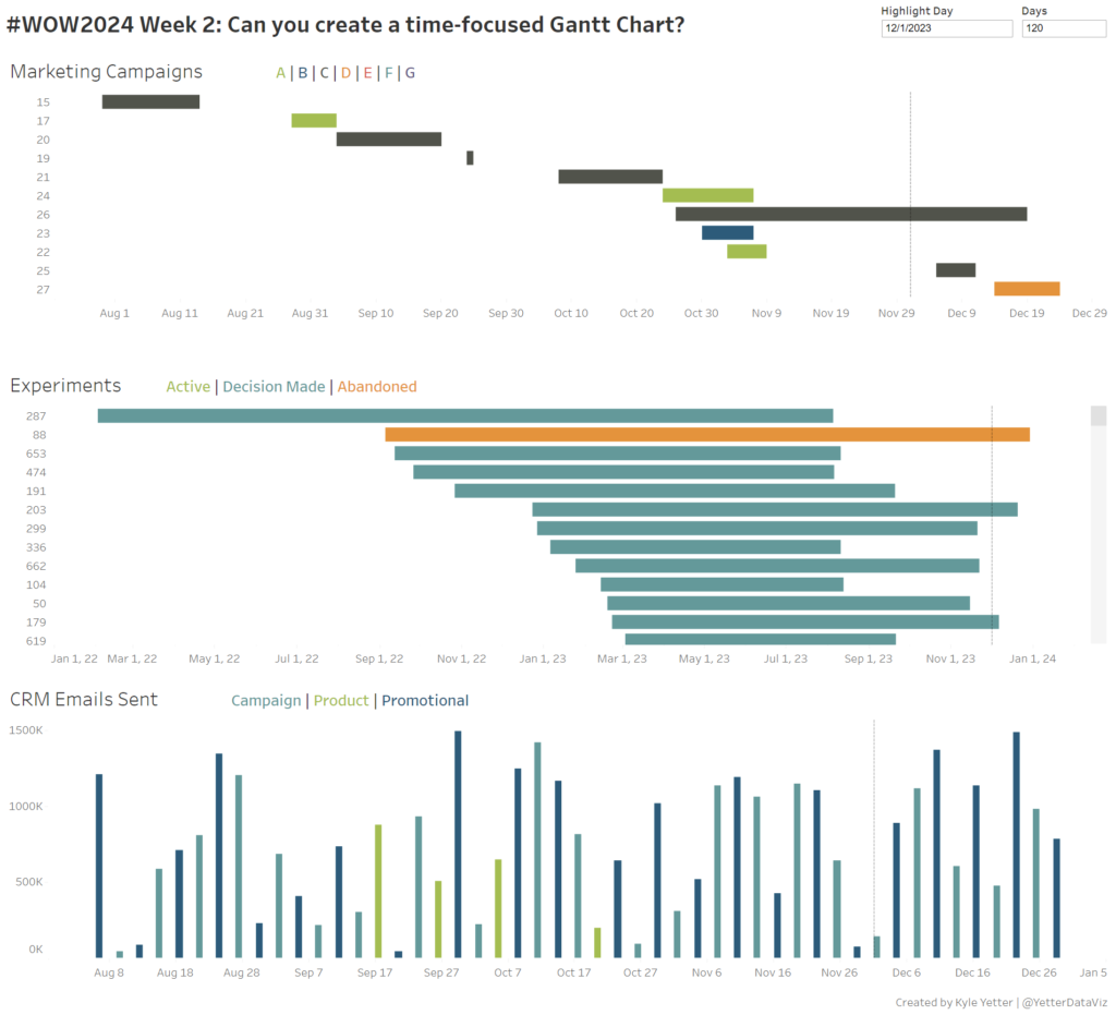
#WOW2024 | Week 2 | Can you create a time-focused Gantt Chart?
Introduction This week’s challenge is another from recent experience. As we have spikes or drops with various metrics, we found that we often asked the same questions…What marketing campaigns were happening at that time? Did we send any big email campaigns around then? Did we launch a new product feature or experiment? With all these …
#WOW2024 | Week 2 | Can you create a time-focused Gantt Chart? Read More