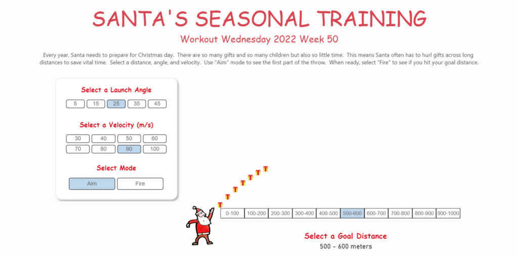
DAX

2022 Week 44 | Power BI: Customer Lifetime Value

Introduction This week, our challenge is to calculate customer lifetime value by quarter using DAX.  This is an advanced challenge so buckle up! As I was working on my challenge for week 44, I stumbled upon the drafted challenge for Tableau on the same week.  The Tableau challenge was… you guessed it… developing a chart …

2022 Week 44 | Power BI: Customer Lifetime Value Read More

2022 Week 32 | Leverage Field Parameters in Measures

Introduction My name is Spencer Hamilton, Analytics Consultant with phData, and I’ll be guest hosting this week’s challenge! For the challenge, we’re going to look at one of Power BI’s newer features, Field Parameters, and create some calculations that dynamically change based on the selected parameter value. In this specific example we’re looking at Sample …

2022 Week 32 | Leverage Field Parameters in Measures Read More

Screenshot from Power BI Workout Wednesday 2022 Week 18

2022 Week 18 | Power BI: Remake this Tableau budget burndown chart

Introduction For the month of May, we are remaking Tableau visualizations with Power BI. Although the visuals made by the two tools may be similar, the calculations and formatting options are a bit different. This makes some things easier in one tool compared to the other. If you use both Power BI and Tableau, feel …

2022 Week 18 | Power BI: Remake this Tableau budget burndown chart Read More

2022 Week 11 | Power BI: Project Budget Tracker

Introduction Your challenge this week is to create a Project Budget Tracker leveraging the IT Spend Analysis example dataset available to everyone in Power BI Service.  We decided to keep the project management theme going this week with this take on tracking how your project is following the budget.  If you did not do last week’s challenge, I …

2022 Week 11 | Power BI: Project Budget Tracker Read More

A power bi report that calculates contrast ratio between two colors

2021 Week 46 | Power BI: Create a Color Contrast Calculator

Introduction This week we are continuing our design theme by making a report about report design. Color is a very important element in report design. Color contrast is not only important for accessibility, it’s also an element of visual hierarchy. You can also use color contrast as a way to make elements on your report …

2021 Week 46 | Power BI: Create a Color Contrast Calculator Read More

Power BI report showing Dutch Bros coffee locations within a radius of a selected city

2021 Week 43 | Power BI: Maps with a Distance Radius

Introduction It’s the final week of mapping month! This week we are plotting points on a map within a selected radius. It’s common to want to see locations, such as stores or restaurants that are nearby to a selected location. This week we are exploring one way to do that in Power BI. This involves …

2021 Week 43 | Power BI: Maps with a Distance Radius Read More

2021 Week 25 | Power BI: Unicode Characters

Introduction This week we are building on Meagan and David’s challenges using the Nobel Prize data. We’re also continuing on our customization journey and will have a bit of fun using unicode values. Unicode is a standard numeric value that represents a character, which can easily be transformed into a character in Power BI using a bit …

2021 Week 25 | Power BI: Unicode Characters Read More

Workout Wednesday Power BI Week 23 2021 Nobel Prize

2021 Week 23 | Power BI: Can You Build a Cumulative Line Chart?

Introduction Continuing with the Nobel Prize data that Meagan began exploring last week, this week extends to consider aspects of individual Nobel laureates. The main visual is a cumulative line chart, but you’ll also provide detail on laureates with a report page tooltip. While additional JSON expansion and transformation was required from the original dataset, …

2021 Week 23 | Power BI: Can You Build a Cumulative Line Chart? Read More

2021 Week 22 | Power BI: Create Your Own Timeline from JSON Data

Introduction Workout Wednesdays for Power BI is now in our sixth month! Thanks so much for joining us. For the month of June, we will have independent exercises that all use the same data source but focus on different aspects of the data and of Power BI. Our dataset for the month comes from Nobelprize.org. …

2021 Week 22 | Power BI: Create Your Own Timeline from JSON Data Read More

Scroll to Top