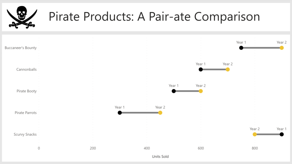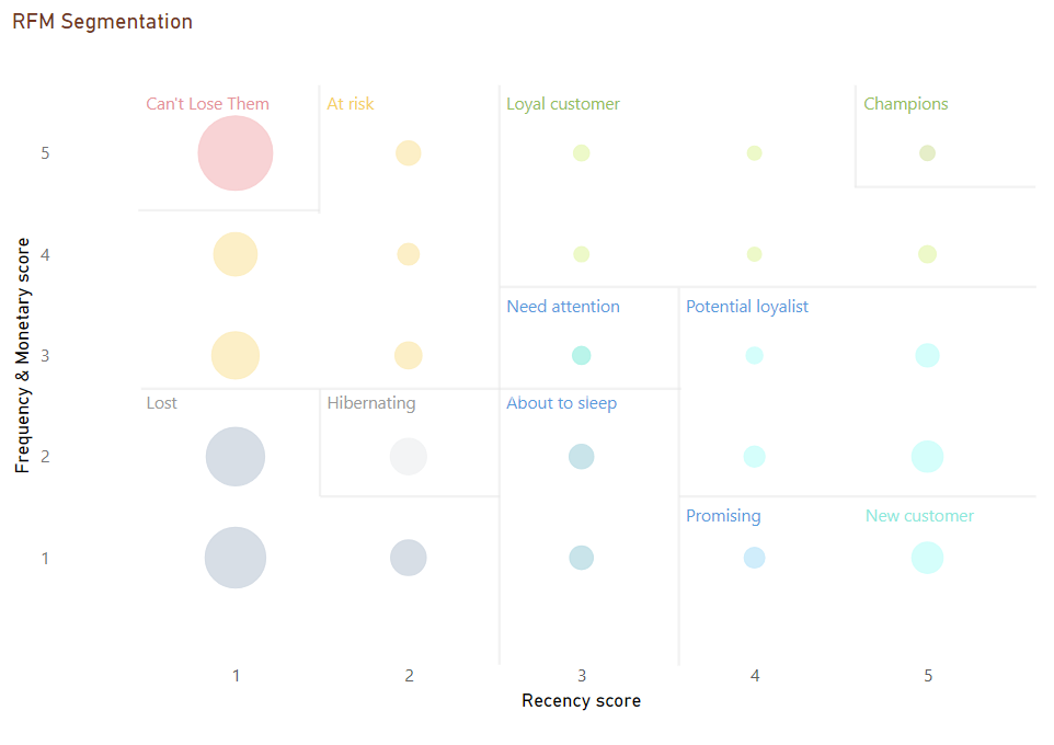
2023 Week 46 | Power BI: RFM Analysis
Introduction This week for Workout Wednesday we are performing RFM (recency, frequency and monetary value) analysis. RFM Analysis is a marketing technique used to quantitatively rank and group customers based on the recency, frequency and monetary total of their recent transactions. A score of 1 to 5 is assigned for each of the three main factors. …