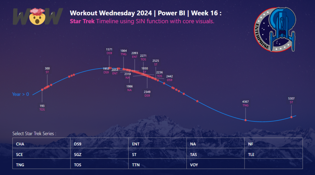
Power BI

2024 Week 11 | Power BI: IBCS Charts with Injae

Introduction Welcome back to Workout Wednesday! This week we’re taking notes out of Injae Park’s portfolio and recreating one of his IBCS charts. IBCS, or the International Business Communication Standards is a set of rules to level up how businesses talk and share info. Think of it as a cheat code for clearer charts and …

2024 Week 11 | Power BI: IBCS Charts with Injae Read More

2024 Week 10 | Power BI: DAX-less Reporting!

Introduction Welcome back to Workout Wednesday! This week’s challenge is for folks who want to practice building reports that do have calculations but do not use complex DAX! I also had a little fun with Microsoft Designer for the images. If you haven’t had a chance to play around with this new AI design tool …

2024 Week 10 | Power BI: DAX-less Reporting! Read More

2024 Week 9 | Power BI: Use Bar Overlap and Border Formatting

Introduction Welcome to this week’s Workout Wednesday. This week, we are taking advantage of some new features in the February 2024 release of Power BI Desktop. We can now have bars overlap in a clustered column chart and hide the inner borders in a stacked column chart. This week, we’ll use those formatting options to …

2024 Week 9 | Power BI: Use Bar Overlap and Border Formatting Read More

2024 Week 8 | Power BI: Build a Pipeline Funnel with Core Visuals

Introduction This week’s challenge we will be utilising visual calculations (this will require turning Visual Calculations on in Preview settings of February 2024 Desktop) and some additional new data label formatting options to create a pipeline funnel with out of the box visuals in Power BI. Visual calculations can be handy for visual specifiic calculations …

2024 Week 8 | Power BI: Build a Pipeline Funnel with Core Visuals Read More

DataViz Makeover of bar chart

2024 Week 7 | Power BI: Report Re-design – Aussie trips to Indonesia

Introduction This week’s challenge is a little different, we will be looking to make-over a report from the Australian Bureau of Statistics. This report contains a lot of information and data sources to download, so it is up to you as to how much or how little you want to do. The primary challenge, however, …

2024 Week 7 | Power BI: Report Re-design – Aussie trips to Indonesia Read More

2024 Week 6 | Power BI: Customer Lifetime Value Matrix

Introduction Welcome back to Workout Wednesday! This week’s challenge is inspired by Ann Jackson, who created the challenge back in 2021 for the Tableau team. Let’s create a Customer Lifetime Value (CLV) Matrix, a tool that marketers use to segment customers based on their value and loyalty to a business. This helps marketers allocate resources …

2024 Week 6 | Power BI: Customer Lifetime Value Matrix Read More

Faceted Strip Plot with Median Overlay

2024 Week 5 | Power BI: Create a Strip Plot with Median Overlay

Introduction Sometimes it can be useful to show all data points instead of aggregating them. That is where an instance chart, also called a strip plot or a barcode plot, can be useful. This week we are building on a faceted strip plot made in 2023 week 35, and adding a median overlay. Inspired by …

2024 Week 5 | Power BI: Create a Strip Plot with Median Overlay Read More

2024 Week 4 | Power BI: Recreate this weather visual with overlapping columns

Introduction I keep seeing a particular visual shared by a Denver-area meteorologist on social media. It seems to be output from weathermodels.com.  I thought it might be fun to make a modified version in Power BI, so that is our challenge this week. While we don’t have native overlapping columns, there is a native solution …

2024 Week 4 | Power BI: Recreate this weather visual with overlapping columns Read More

2024 Week 3 | Power BI: Back to basics with a bar chart

Introduction Welcome back to Workout Wednesday! We’re taking it back to basics this week and creating a bar chart that uses small multiples and conditional formatting. We’re using the #MakeoverMonday team’s data on New Year’s Resolutions and the design is inspired by a Makeover Monday participant! A huge thank you to Ela Piwowarska for creating her submission and …

2024 Week 3 | Power BI: Back to basics with a bar chart Read More

2024 Week 2 | Power BI: Soda Pop Sales in a Jittered Column Chart

Introduction This week we have our first guest post of 2024! Today’s challenge comes from Imran Haq (LinkedIn, X). I have always admired his Deneb skills, so I’m excited to share this report with you today. We are making a jittered column chart with Deneb. The theme of soda (or pop, coke, or whatever you …

2024 Week 2 | Power BI: Soda Pop Sales in a Jittered Column Chart Read More

Scroll to Top