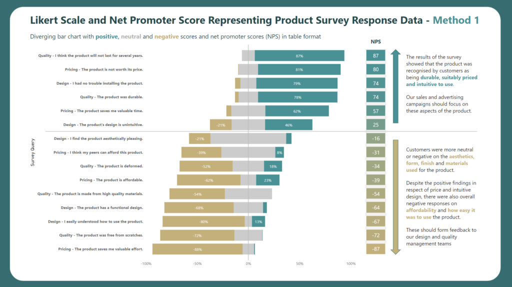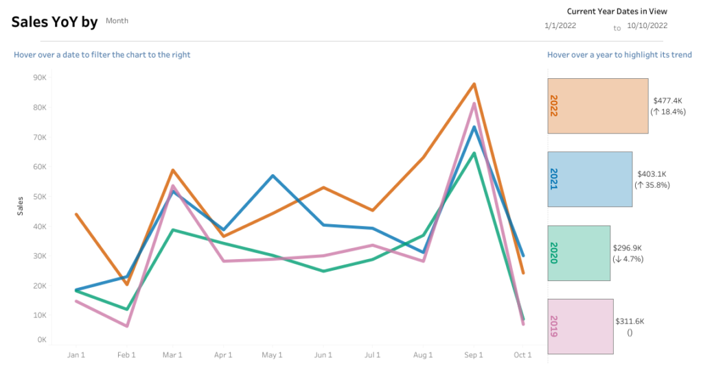
#WOW2022 Week 41: Can you do YoY comparisons?
Introduction Welcome to week 2 of #WOW2022 community month! I’m excited to have Liam Huffman joining me for this week’s challenge. Liam is a fellow colleague at Evolytics and is a great member of the #datafam! With that – here’s Liam Hey everyone! I’m excited to be here sharing my challenge dashboard. This one focuses …