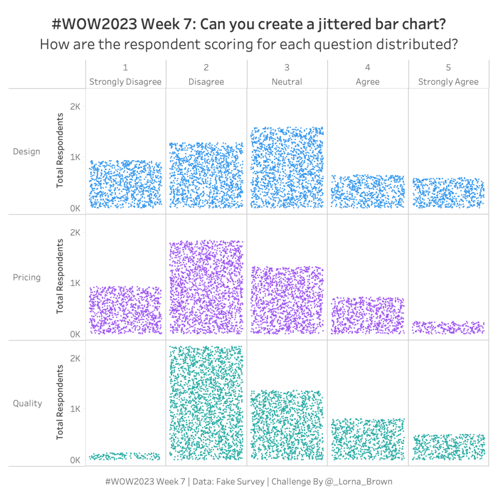
#WOW2023 Week 7: Can you create a Jittered Bar Chart?
NPS Survey data can be tricky to wrangle and work with. Check out this week’s Tableau #WorkoutWednesday and see if you can do it!
NPS Survey data can be tricky to wrangle and work with. Check out this week’s Tableau #WorkoutWednesday and see if you can do it!
Introduction Can you believe it’s 2023 already? No me neither, but we have a cracking line up for this year that makes me excited to still be apart of the Workout Wednesday Team. If this is your first time here, Welcome to #WOW2023. The aim of this community initiative is to rebuild the visualisation using a …
#WOW2023 Week 1: Can you use Image Role & Dynamic Zone Visibility? Read More
2022 has gone so quick, like every other year prior, but the years do seem to be getting quicker. I just wanted to write a quick blog on achievements this year! As with every year we will have published 104 Workout Wednesdays between Tableau & PowerBI, I am extremely grateful for all of our contributors …
Introduction This week we have an early release due to doing a live session at VizIt London. For this week I wanted to focus on the new feature, Dynamic Zone Visibility and I have taken inspiration from an old WOW from Ann in 2018. See older challenge here Click to open in Tableau Public Requirements …
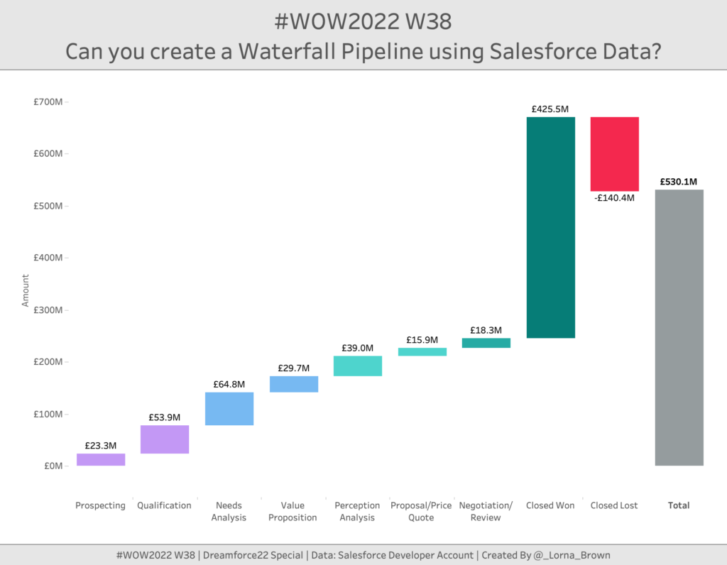
Introduction This week is Dreamforce; Salesforce’s conference. So I thought I would stay on theme and use Salesforce Data. When I first started to see Salesforce pre-built dashboards they included several elements, but the one we are going to focus on today is the Waterfall chart. This allows us to see how much value is …
#WOW2022 W38: Can you create a Waterfall Pipeline using Salesforce Data? Read More
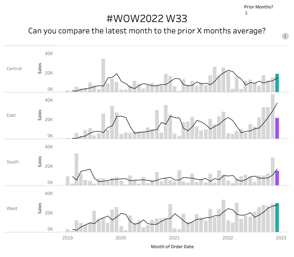
Introduction When looking through the challenge insights I realised we haven’t had many of the fundamental LOD style Workouts for a while. So this week we take a look at how does the latest month compare to the prior X months average? Click to open in Tableau Public Requirements Dashboard Size: 800 x 700px 2 …
#WOW2022 W33: Can you compare the latest month to the prior X months average? Read More
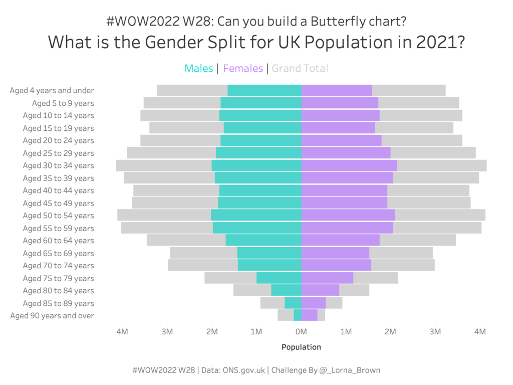
Introduction This week my challenge comes from two places of inspiration. Firstly the ONS website and secondly a final interview for someone applying to the Data School. I loved the concept of the chart and it helps with context and also synchronisation of axis. Have fun. Click to open in Tableau Public Requirements Dashboard Size: 800 …
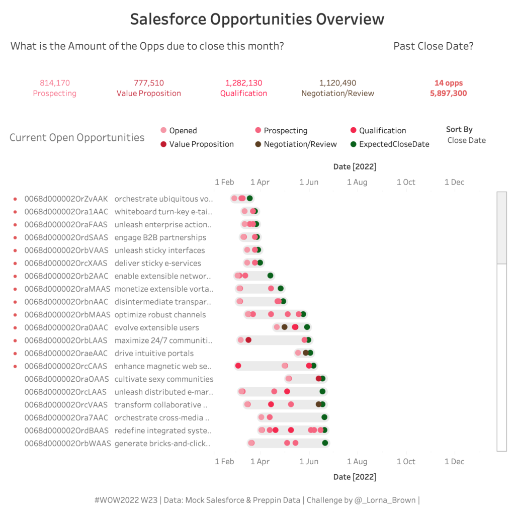
Introduction Welcome to Week 23 of Workout Wednesday. This week is a special week as we have teamed up with Preppin Data to bring you a double challenge. Even then I think both challenges can be done in multiple platforms. You might also want to dabble in Power BI as they are also doing this double …
#WOW2022 W23 | Tableau : Prep That and Build This! Read More
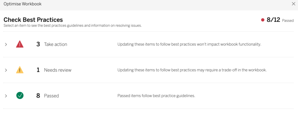
Introduction For this week I wanted to focus on a recently release feature. The workbook Optimizer. You will need to use 2022.1. It will give you a list of actions to take to make the workbook better. See if you can make this workbook pass all 12 actions! Requirements Dashboard to maintain the same Use …
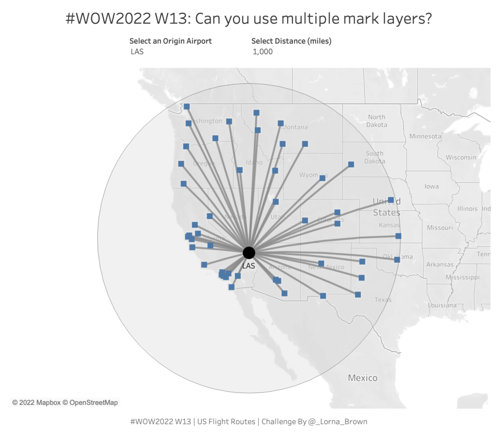
Introduction This week I hone in on majority of those spatial calculations within Tableau. I love the flexibility that Mark Layers allows us to have. Prior to Tableau 2020.4 maps could only have 2 layers and creating this hub and spoke style map would require some serious data preparation. This workout requires 6 calculations. Click …