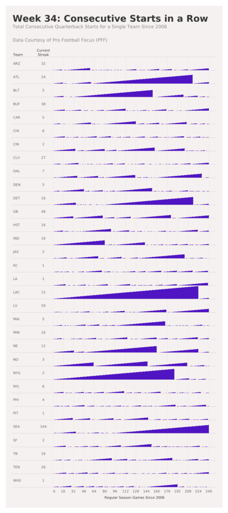
2021 Week 34: How Many Consecutive Starts?
Introduction Today I’m excited to share a challenge in collaboration with Dr. Eric Eager at PFF. PFF analyzes data about professional football (in this case the American version). In this game, there are many players, but the most critical player supports a role called the Quarterback. In this challenge you’ll count the number of consecutive …