
Introduction
I’ve got an exciting challenge for you this week! It involves collaboration with a peer of mine in the data community (Jami Delagrange, who you may recognize as an upcoming Community Month contributor) and also a challenge that involves working with COVID-19 data.
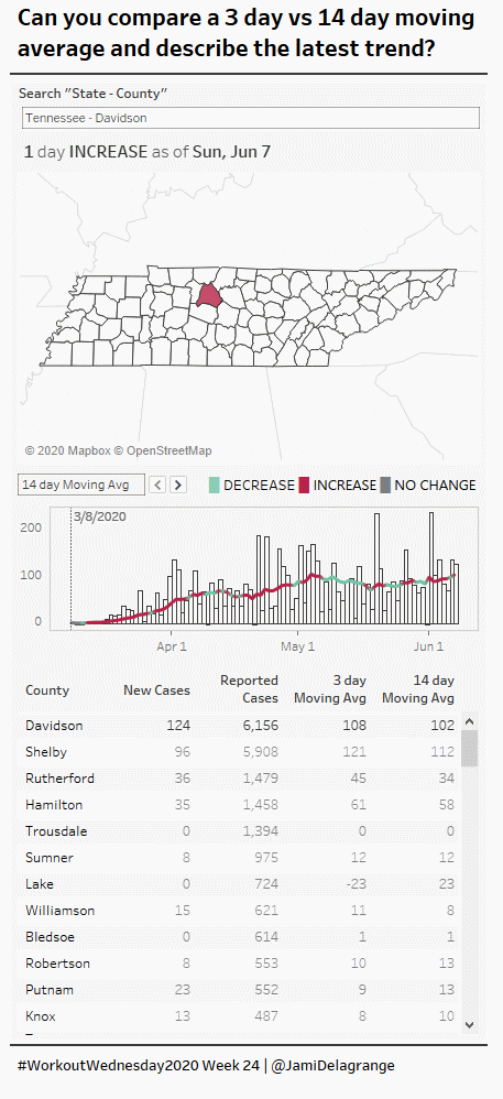
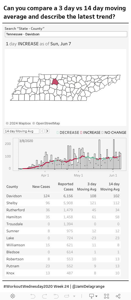
This built-for-mobile dashboard was born out of seeking to understand the state of COVID-19 in different geographic areas of the United States and to support decision makers who are trying to decide if it is the right time to begin different phases of “re-opening.” Jami was charged with making this a reality.
To support the ask, Jami did some research and found a few remarkable resources on the Tableau COVID-19 hub and also some compelling community examples. One visualization stuck out to her, and it formed the basis for our challenge this week: a map by Christian Felix showing by county whether the 3 day moving average of COVID cases was above the 14 day moving average number of COVID cases, indicating either an increase or decrease, and also computing the length of the subsequent trend (eg: decreasing for X days).
So that’s your challenge for this week. Rebuilding a map that does day-by-day comparisons of a 3 day moving average vs. a 14 day moving average, computes the number of days that a county is on a certain trend, and then displays it on a map. And by the way, all data manipulation must be done in Tableau (this is where I had a slight role to play).
I will forewarn you – this week will really challenge your understanding of Table Calculations.
Finally, a friendly caveat from us before we get to requirements: In no way should the analytical choices and resulting visualizations serve as a substitute for using recognized expert opinions from national and international health and welfare organizations on COVID-19 in your geographic area.
Requirements
- Dashboard Size: 450 px by 1000 px
- # of Sheets – up to you
- Create a table for US counties that has
- # of New Cases for latest data date (currently June 7 in the data set)
- Total Reported Cases
- 3 Day Moving Average # of new cases
- 14 Day Moving Average # of new cases
- Create a dual axis bar + line chart with
- # of new cases by day
- Line of average that can be toggled between 14 or 3-day
- Color line chart based on increase or decrease trend
- Create a county map that highlights the chosen county and shows the trend of green or red based on increase or decrease of 3-day vs. 14-day comparison
- Build a mini-BAN which describes the number of days the county has been on the trend and whether it is an increase or a decrease (or no change)
- Match formatting and tooltips, specifically
- Tooltips within map, table, and chart
- Reference line of first reported case
You may find it helpful to begin with the table to build your solution.
Dataset
This week uses the COVID-19 data set provided by the Tableau COVID-19 data hub. You can access the hyper file or a CSV via data.world.
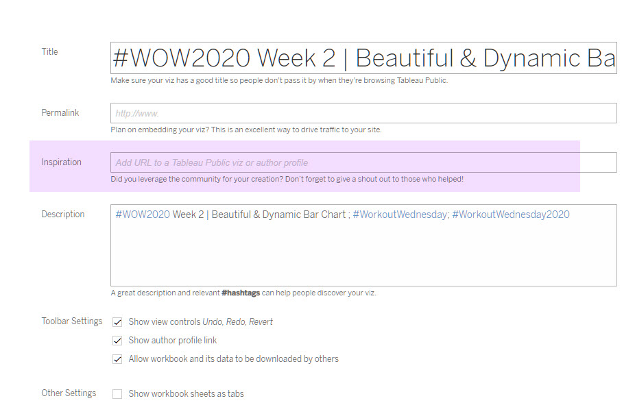
Attribute
When you publish your solution on Tableau Public make sure to take the time and include a link to the original inspiration. Also include the hashtag #WOW2020 in your description to make it searchable!
Share
After you finish your workout, share on Twitter using the hashtag #WOW2020 and tag @JamiDelagrange, @AnnUJackson, @LukeStanke, @_Lorna_Brown and @IvettAlexa
Solution
Interactive
I am a little confused about the calculations.
First, what’s trend for? I naturally thought it’s the trend of the daily new cases. However,it seems that you are using the logic below to decide the trend of new cases:
ELSEIF [Moving Average 3 day (new cases)] [Moving Average 14 day (new cases)] THEN ‘INCREASE’
ELSEIF [Moving Average 3 day (new cases)] = [Moving Average 14 day (new cases)] THEN ‘NO CHANGE’
END
So are we calculating the trend of moving average?
If so, shouldn’t we compare using the same time range? For example, to decide the trend of moving average of past 3 days, we compare the 3-day average of 6/5 to 6/7 and the 3-day average of 6/4 to 6/6?
Hi Eva – Thanks for your feedback and questions! We are comparing the 3 day moving average vs. the 14 day moving average to see if there is an increase in positive cases on a particular day. We’re using varying moving averages to smooth out the data opposed to showing the raw difference in number of new cases. The trend comparisons are for different lengths of times to demonstrate that “today’s value” is really the average of the 3 most recent days, and the comparison is the 14 day moving average.
We’ve just published the solution video, so I encourage you to check it out!